An In-App Promotion Pattern
A Free Trial entry flow rebuilt by reading the previous round's data backwards, taking sign-ups from zero to 8 paying U.S. customers in the first quarter after launch, and becoming a reusable template for later promotions.
- Industry
- B2B SaaS, Logistics
- Role
- Product Designer
- Date
- 2025 / 07
- Tools
- GA4, Mixpanel, GTM, Figma
New paying U.S. customers in the first quarter after launch, up from zero in the previous round.
- The problem
- Phase 1 of GoFreight's Free Trial promotion shipped and brought in zero applications. The full funnel of analytics it left behind, every step and every drop-off, sat unused.
- What I did
- Read that funnel backwards to find where it broke, re-targeted the people who could actually start a trial, and moved the entry onto the pages they work on every day, opening an in-app modal instead of an external form.
- The signal
- 0 → 8 paying U.S. customers in the first quarter, and the placement method carried over to later promotions.
A second run at the Free Trial entry
This was the second phase of GoFreight's move toward product-led growth, where customers discover and start a trial through the product itself instead of through a sales call. I owned the Free Trial entry flow.
Phase 1 had already shipped, a Free ISF promotion, and it ended with zero applications submitted. What it left behind was a full set of analytics, every step of the funnel and every drop-off, recorded and sitting untouched. I started there, before any new research.
Reading Phase 1 backwards
I read the Phase 1 funnel backwards. Each place users dropped out pointed to a specific design problem.
Saw ISF modal, watched How It Works
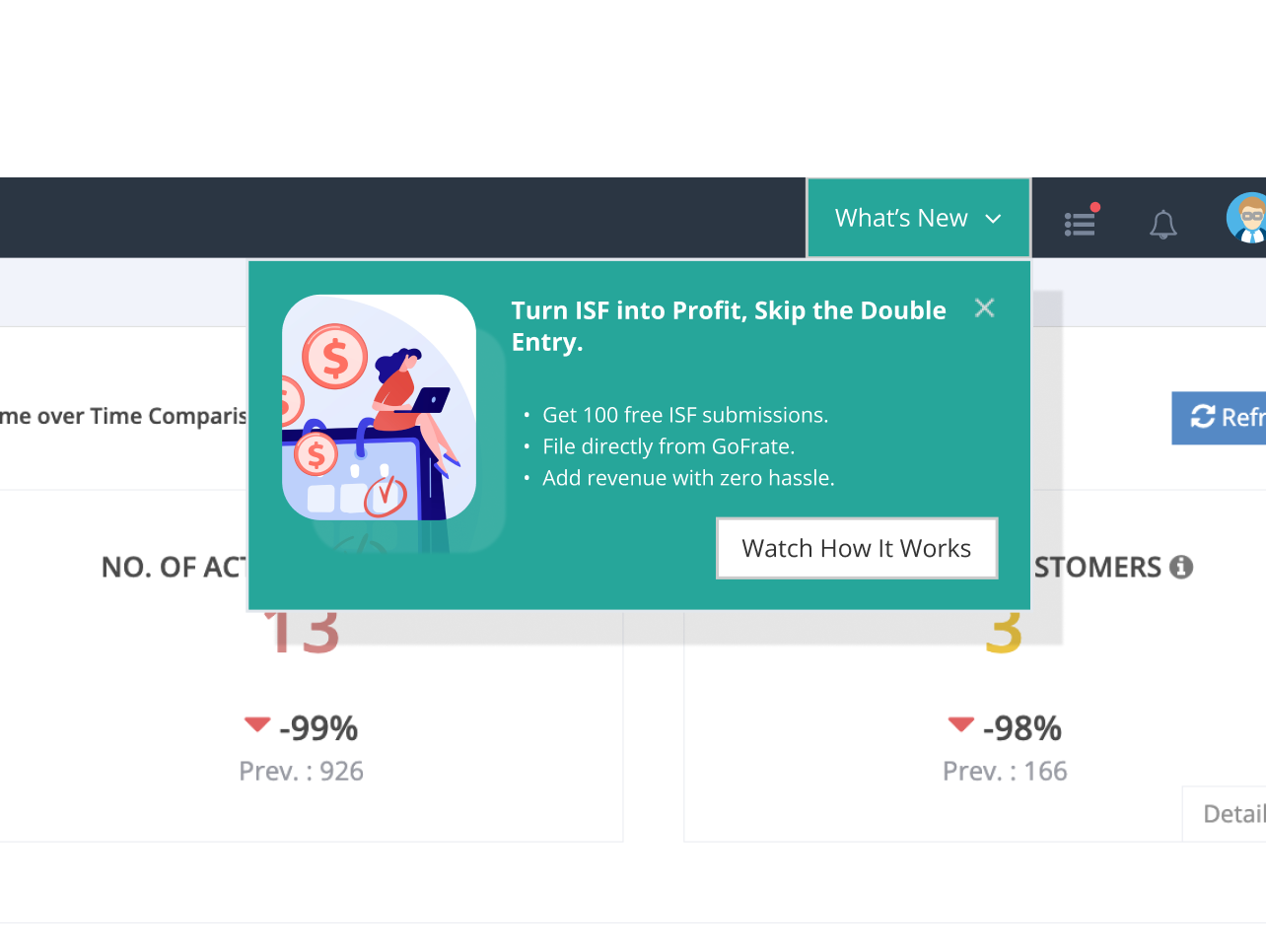
The What's New dropdown sits outside daily workflow. Of the 263 users who saw the promo, 95% skimmed past it without engaging.
Watched video, clicked Apply Now
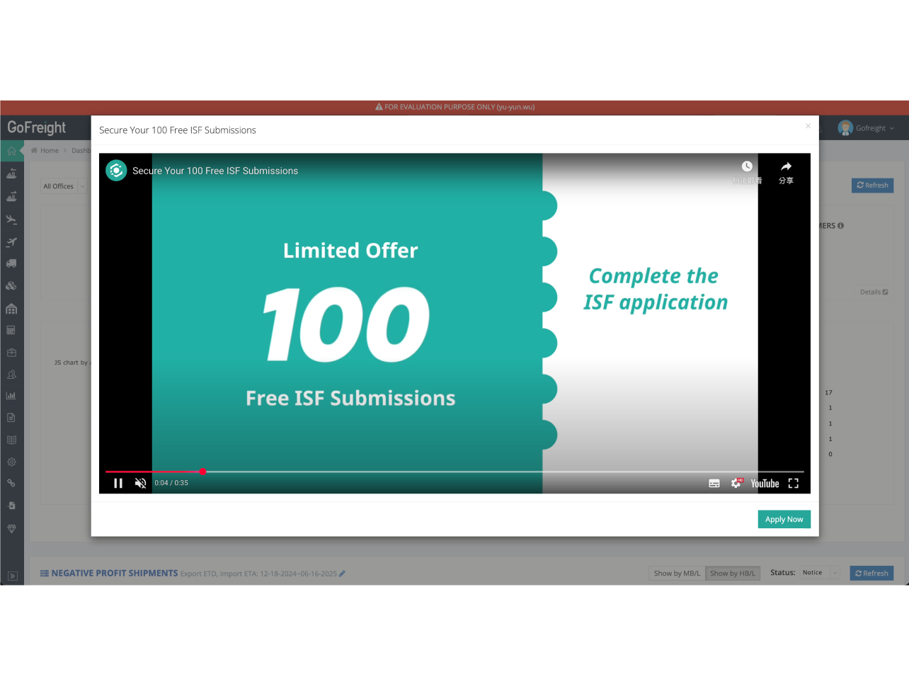
Average watch time was 11 of 35 seconds. The opening didn't earn the next 24 seconds, and 95% dropped off before the CTA.
Filled external form, submitted
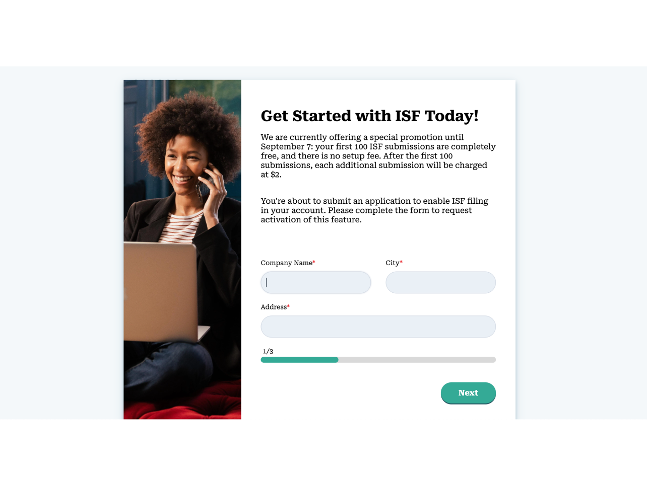
Apply Now redirected out of GoFreight to an external HubSpot form with a high field count. No one came back to complete it.
The surface, the video, and the form were all problems with the flow itself. Underneath them sat a fourth one, about who the flow was being shown to.
The audience it was missing
Phase 1 had been shown to the people with the least power to act on it.
It was aimed at OP operators. They were the ones on the pages, but none of them had the authority to start a trial. The people who did, GMs and OPMs, were assumed to live on dashboards and reports, away from the operational screens.
In small-to-mid-sized forwarders that assumption breaks. GMs and OPMs often double as OPs. They open invoices and check shipment status on HBL List themselves.
To find where they actually spend time, I pulled GA4 for the pages GMs and OPMs visit most. They opened these pages most often, and stayed on them longest. These were where the day actually happened.
- 7.73%
- of GM and OPM pageviews landed on HBL List, where they stayed about 39 minutes on average
- 3.24%
- on Invoice Entry, the next working surface down, about 34 minutes
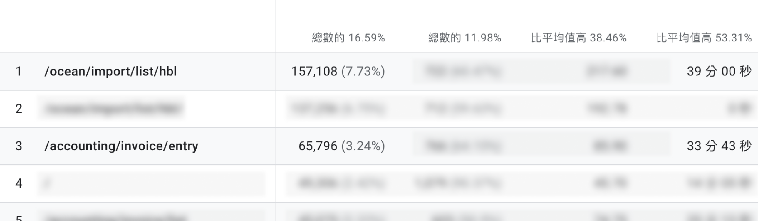
That gave the rule for placement. Put the entry on the surfaces they pass through as operators, and stay off the decision-maker-only pages.
From five placements to two banners
Five candidate placements, ordered by how deeply each sits in the daily workflow.
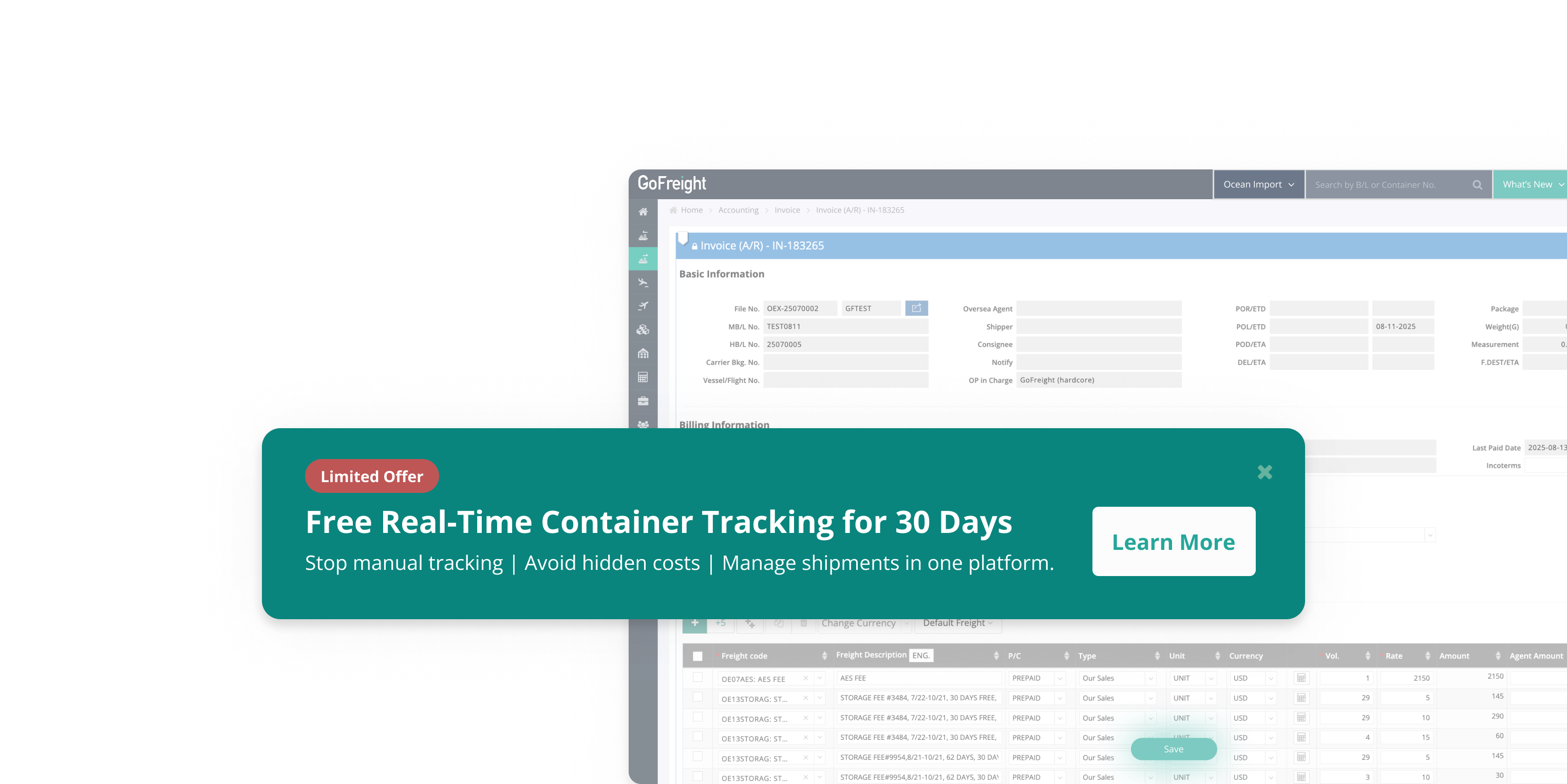
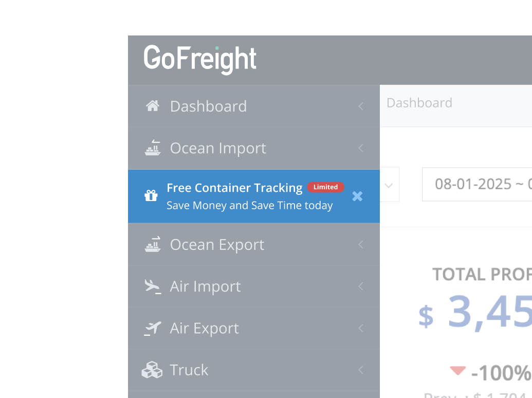
On daily working surfaces
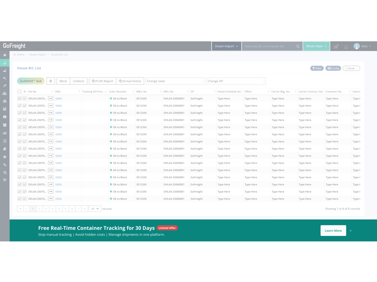
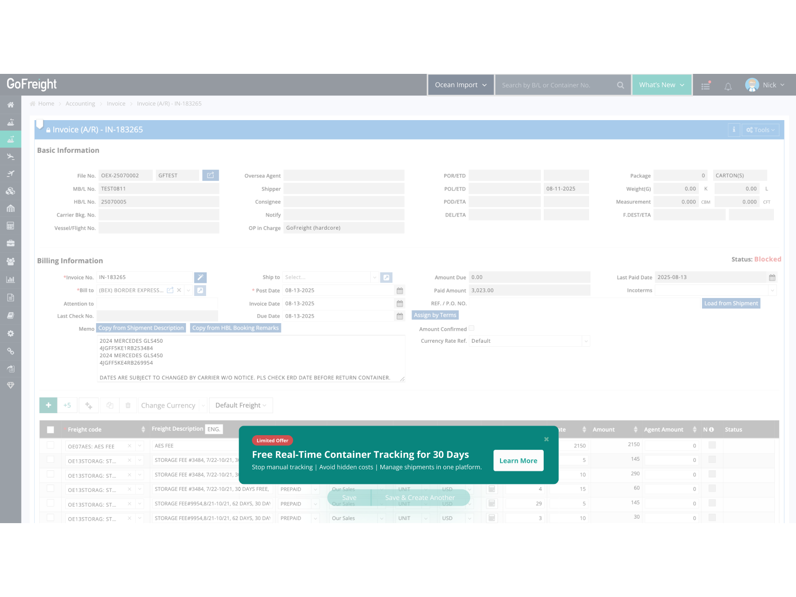
These sit on the surfaces GMs and OPMs use every day. HBL List is where they spend most of their time, drilling into Shipment Entry is the common next step, and HBL Card sits on the right of Shipment Entry. The three form one continuous path, so an entry placed at any of these nodes would surface naturally as users move through their work.
Global entry points
These aren't tied to a single page. Search Bar and Navigation are the two components users pass through most, so even though they aren't exclusive to GMs and OPMs, the path is core enough to reach them at high frequency.
Convergence
The criteria were GA4 reach and engineering cost. Of the five, HBL List and Invoice Entry reached the most of the target audience, at 7.73% and 3.24% of GM and OPM pageviews, so they went into development. Navigation and Search Bar carry high site-wide traffic but reached fewer of the people who could actually start a trial, so they were shelved on timeline.
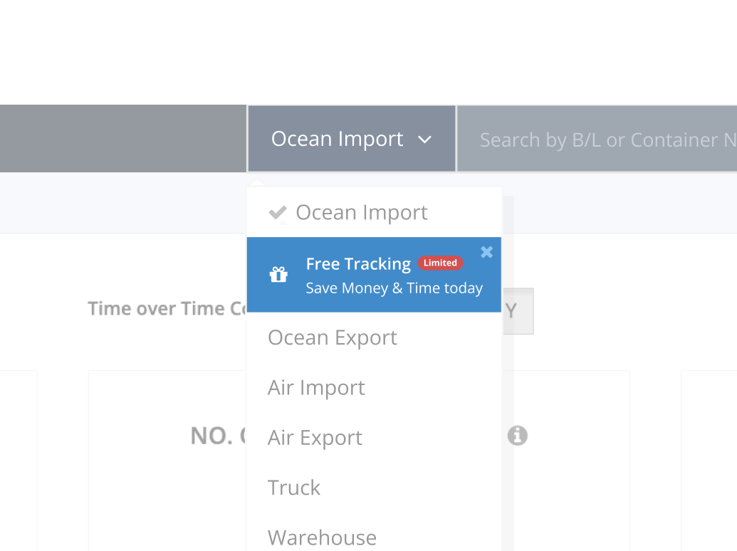
The in-app flow
The two banners opened an in-app modal, replacing Phase 1's redirect out to HubSpot.
Step 1
On HBL List
Step 1
On Invoice Entry
Step 2
Modal form
Step 3
Thank you
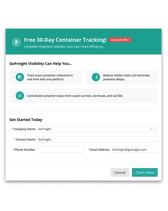
In-app modal form
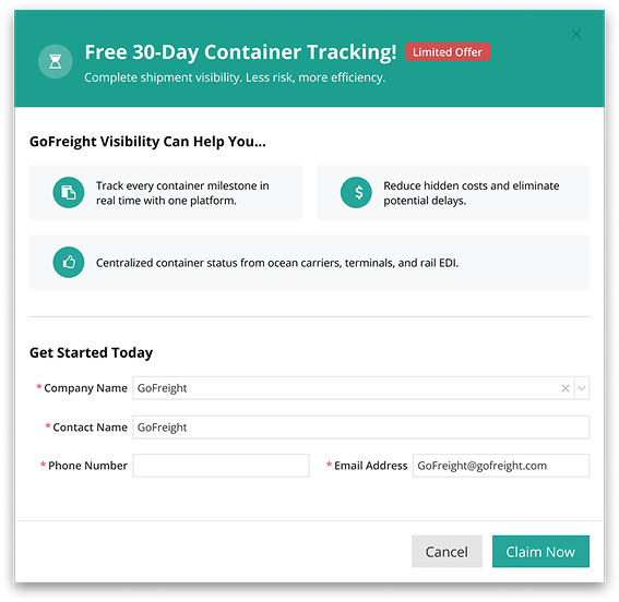
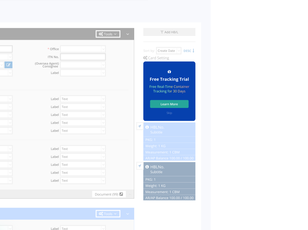
Phase 1 sent users out of the product to a long form, and no one came back. This time the form stayed in the product and dropped to four fields, all auto-filled from the user's logged-in context, Company Name, Contact Name, Email Address, and Phone number. Users only confirm and submit.
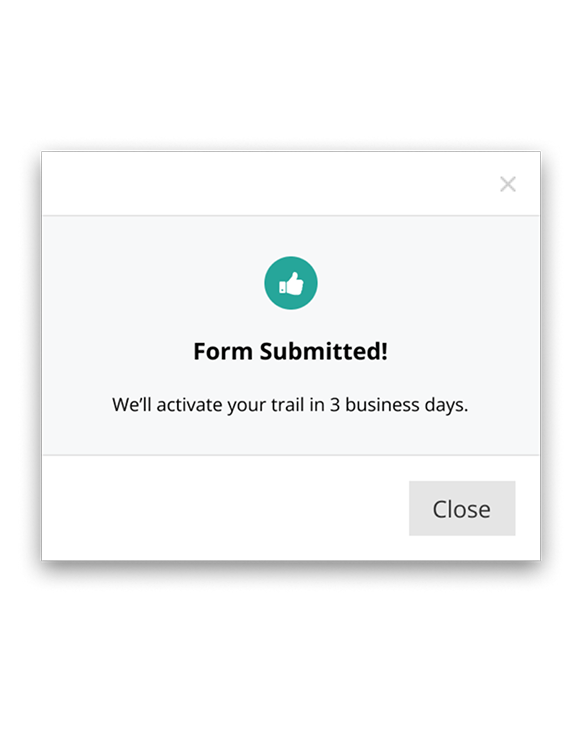
After submitting, a Thank You message tells the user their assigned PM will reach out within three business days to activate the 30-day trial. Submitting doesn't auto-activate it, which reflects GoFreight's sales process where a PM is still involved.
CTA wording: Learn More
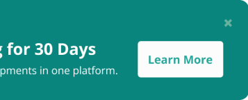
For the button we considered Try Now and Start Free Trial. Both promise something the next screen doesn't deliver, since submitting opens a form rather than starting a trial. We went with Learn More, to match what actually happens next. The banner copy was iterated with the US-based Marketing team.
What changed
| Phase 1 (Free ISF) | Phase 2 (OI Visibility) | |
|---|---|---|
| Placement | "What's New" dropdown | HBL List + Invoice Entry banners |
| Content | 35-second video | Banner + Learn More CTA |
| Form | External HubSpot redirect | In-app modal, 4 auto-filled fields |
| Targeting | OP / OPM / GM | GM / OPM |
| Applications | 0 | 8 (from 8 companies) |
| Paying customers (Q1) | 0 | 8 |
8 applications came from the 30 targeted users, across 8 distinct companies, and all 8 became paying U.S. customers in the first quarter after launch. That reads as real intent rather than a casual click. The sample is small, so the next round will scale across regions and company sizes to see whether the pattern holds.
What carried over
Two pieces of this outlived the project.
A placement I proposed but didn't build was picked up by another designer for the In-Entry Audit case, where it shipped as the gift-card entry point.
Reading GA4 reach to find workflow nodes became a reference pattern that other in-app promotions now start from.
For a sales-led space like forwarder SaaS, it's a small proof that even ops-heavy B2B software can carry a self-serve trial.
What I'd carry forward
The method I'd carry forward is reading backwards from data that's already there.
Phase 1's records had been sitting unused. Stacked together, Mixpanel, HubSpot, and GA4 turned each bottleneck into a specific design problem, and none of it needed new user research to find.
Most of the work was getting people aligned on what the data said. I asked the Senior PD for GA4 access, then brought the page-frequency numbers to the PM team to make the case for moving the promotion off the cluttered What's New surface onto the pages users actually work on. When engineering flagged the Global Navigation work as costly, that same GA4 reach ranking was what let us agree to focus on the top two placements and ship inside the timeline.

Open questions for the next round
- What kept the other 22 targeted users from clicking the banner; qualitative interviews would help answer this
- A/B testing the CTA wording to validate whether "Learn More" is the optimal choice
- Whether auto-activating on submission could lift the completion rate further