ServicePleX:
A Smart Pole Management Platform
An AIoT platform that unifies 10+ device types per pole into a single system, deployed across 5+ large-scale sites including smart science parks and public spaces.
- Industry
- B2B SaaS AIoT
- Role
- UX/UI Product Designer
- Date
- 2023–2025
When I joined, ServicePleX was a rough proof of concept, one or two devices on a single screen. It had to become a product a city could run for real, with far more device types, each from a different vendor, across multiple sites, and it had to get there on a deadline. So I treated it as a growth problem from the start, building for the devices still to come.
Review the product around how operators use it and manage their sites, and make it easier to use.
Integrate the specific devices each client was asking for.
As the only designer, I acted as PM, deciding with engineering and leadership what each feature did and where it lived. My industrial design background also took me where a software designer rarely goes, co-designing the physical pole with our industrial designers and then designing the software that runs it.
- 4
- Designed from zero
- 2
- Rebuilt from the POC
- 10+
- Device types
- 5+
- Large-scale sites
What ServicePleX does
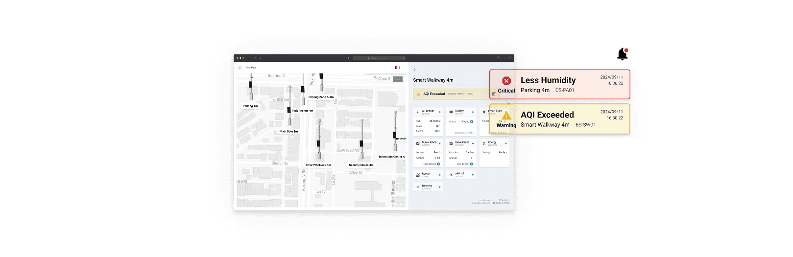
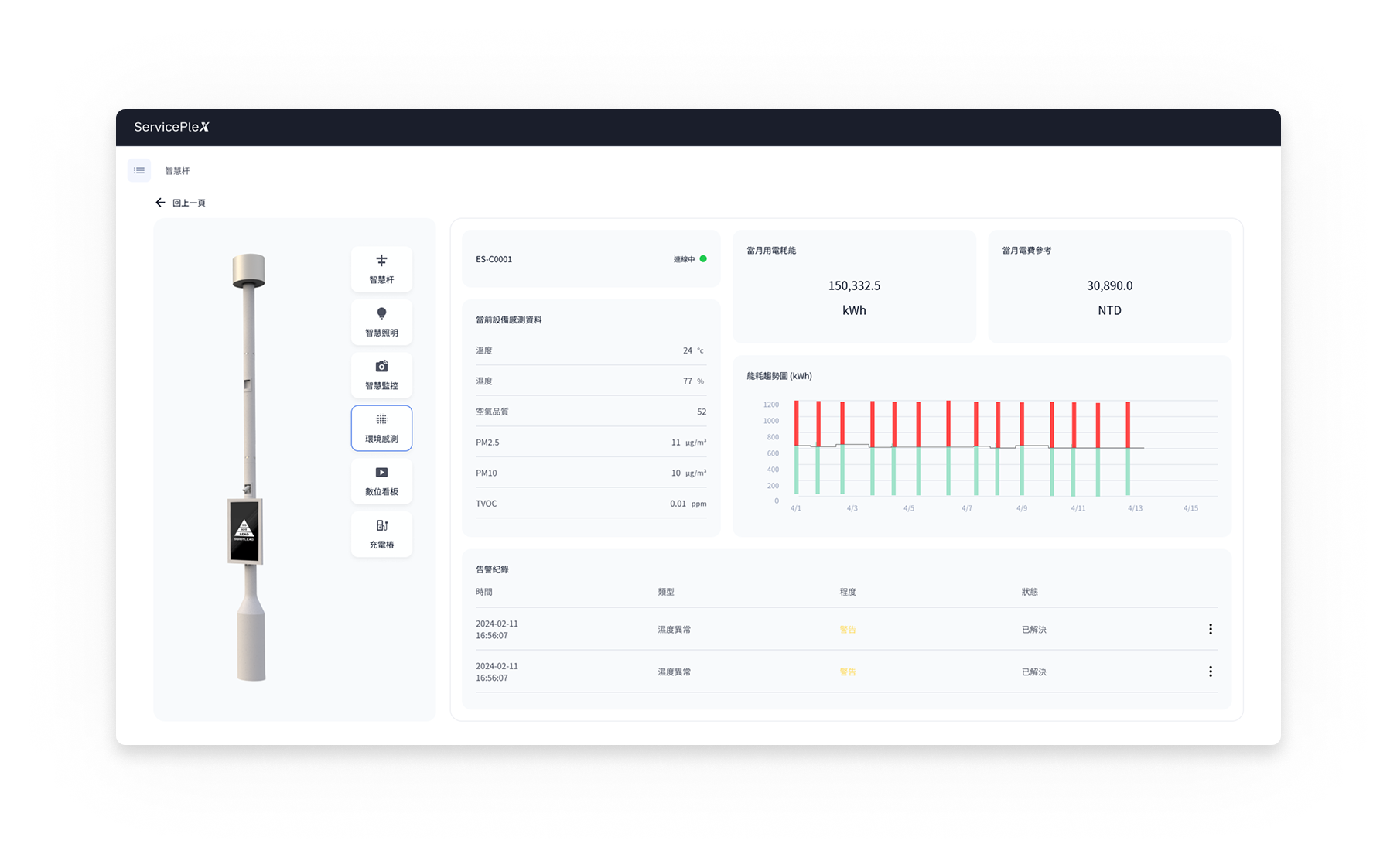
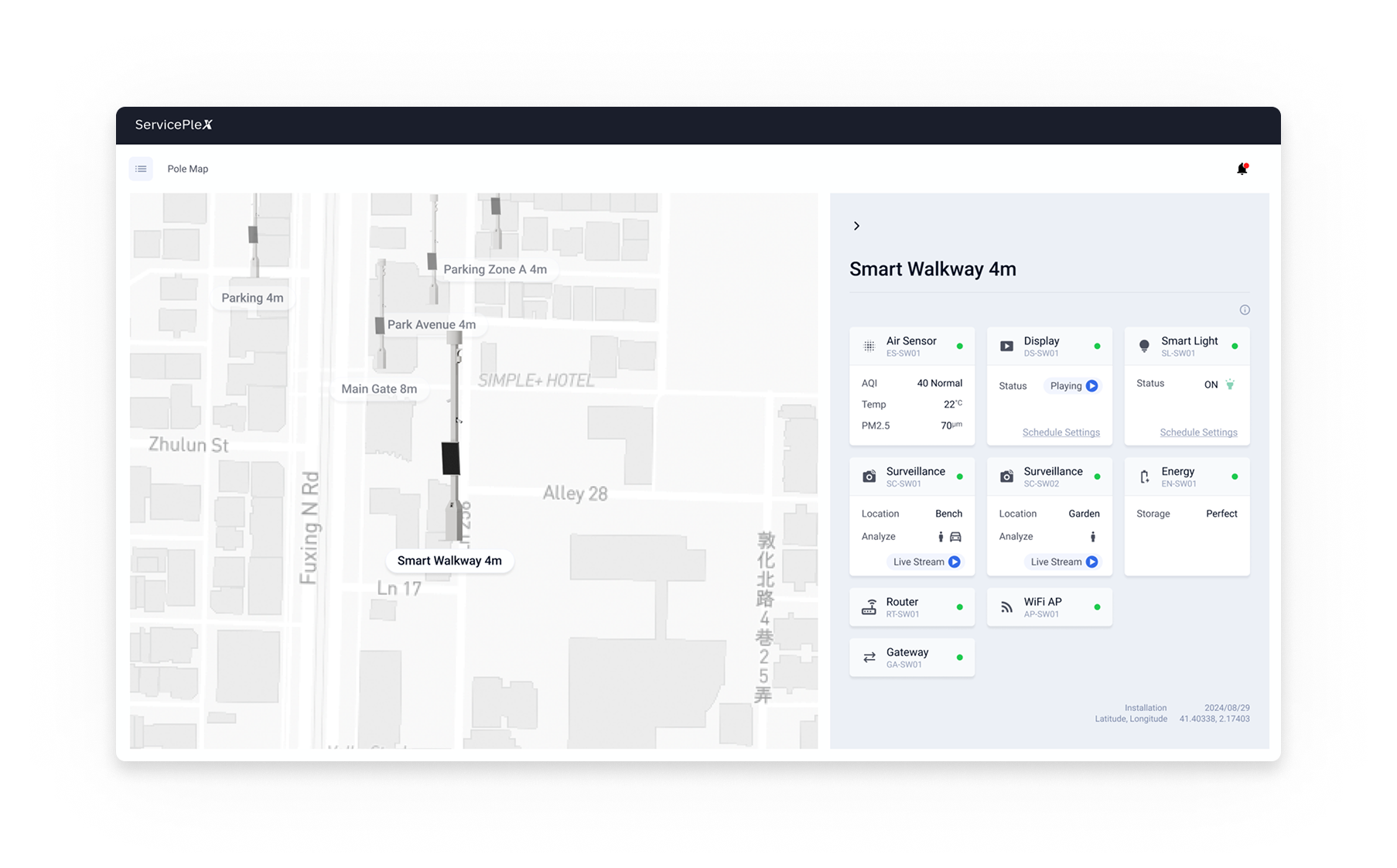
ServicePleX is the software a city uses to run a network of 5G smart poles. A single pole carries 10+ kinds of device, from surveillance cameras and environmental sensors to smart lighting, EV chargers, and digital signage, most of them from outside vendors. It pulls them into one place, built to:
- keep public spaces safe, spotting and responding to incidents faster
- run a whole site remotely, with fewer crews on the ground
- waste less energy, tracking power and sending it where it's needed
.png)
Surveillance camera (VMS)
Live video with license-plate recognition. Pick a person or vehicle and follow it across every camera on the site.
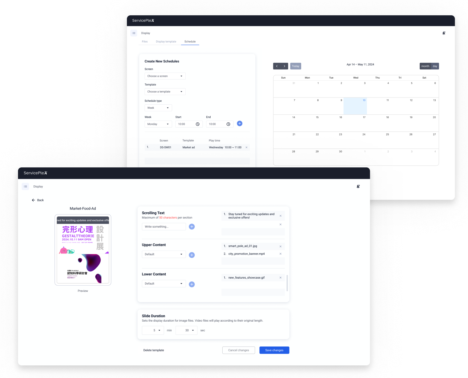
Digital signage
Non-technical staff lay out content from templates and schedule what shows on each pole's screen, no engineer needed.
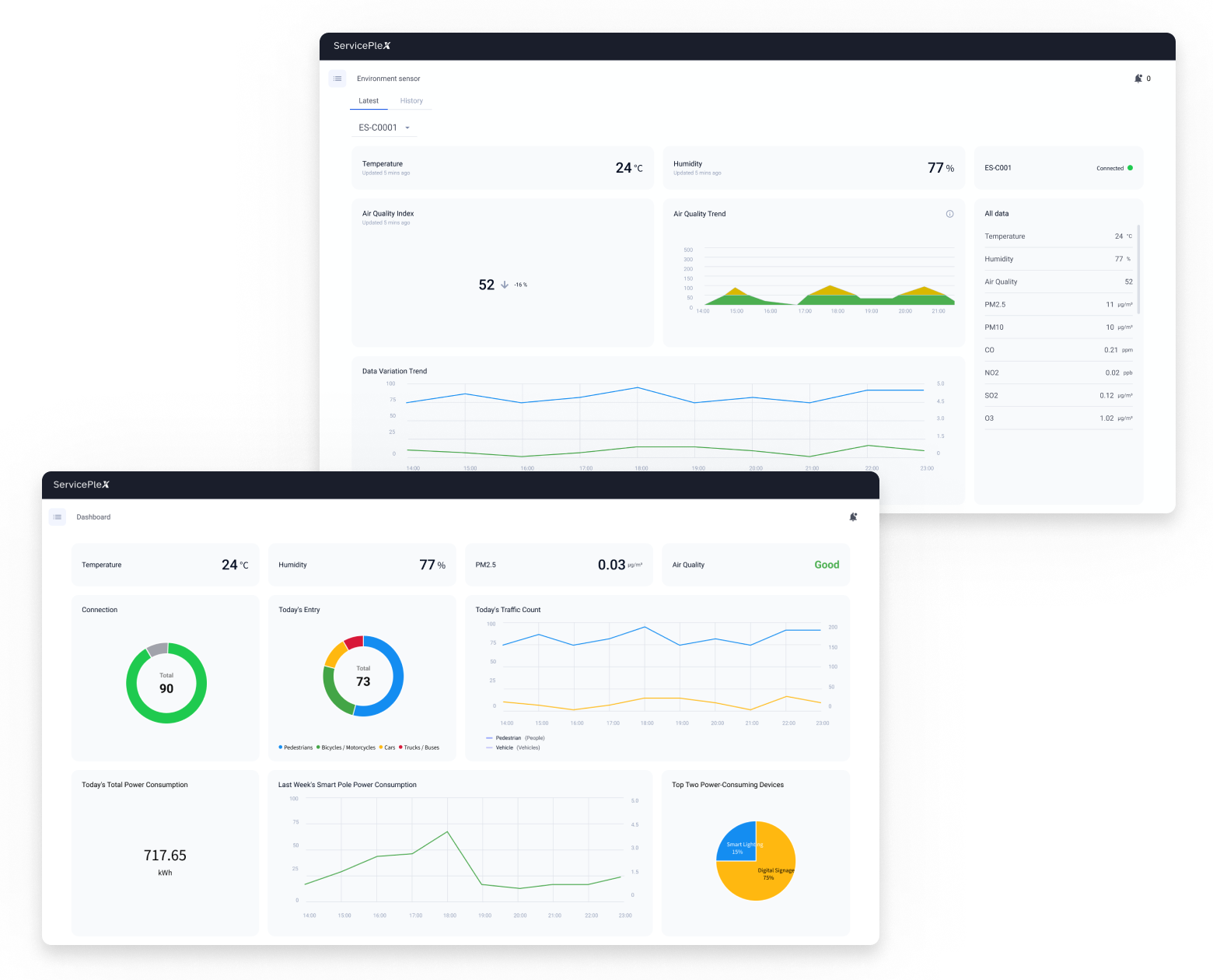
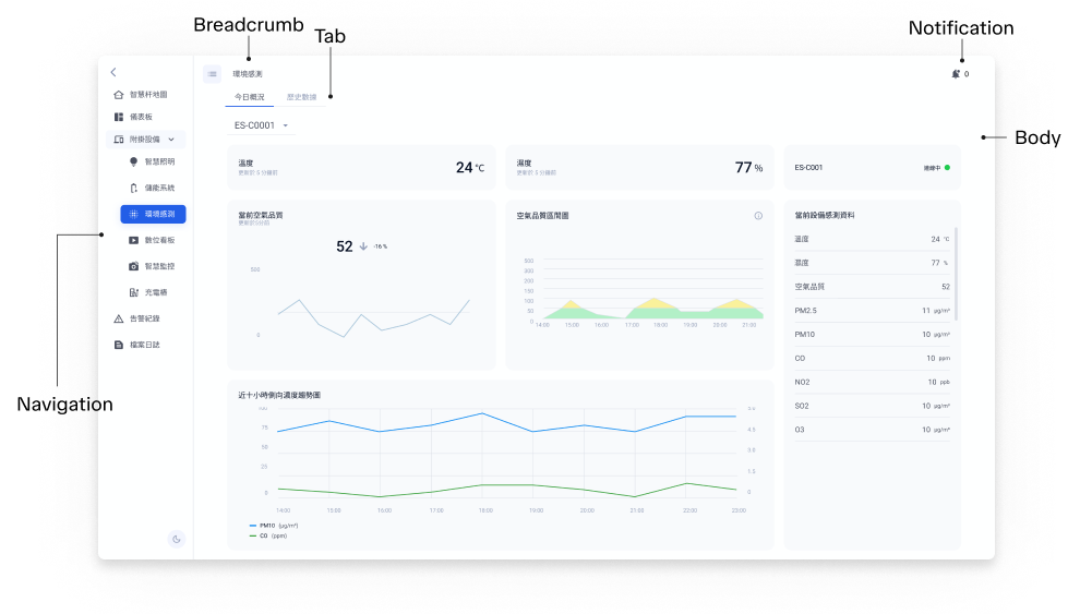
Environmental dashboard
A live read on temperature, humidity, air quality, and particulates, with history over time.
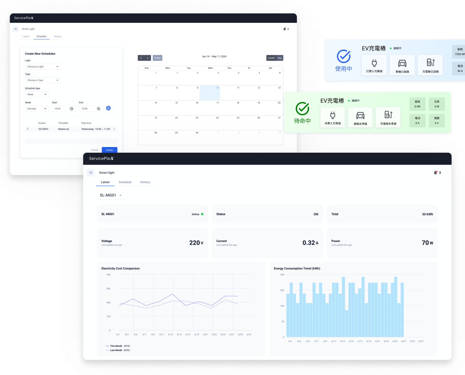
Smart lighting, intercom & EV charging
Each built on the same components and structure, so a new device type goes live without teaching operators anything new.
.png)
Pole map (GIS)
Every pole on a site on one map, device status at a glance.
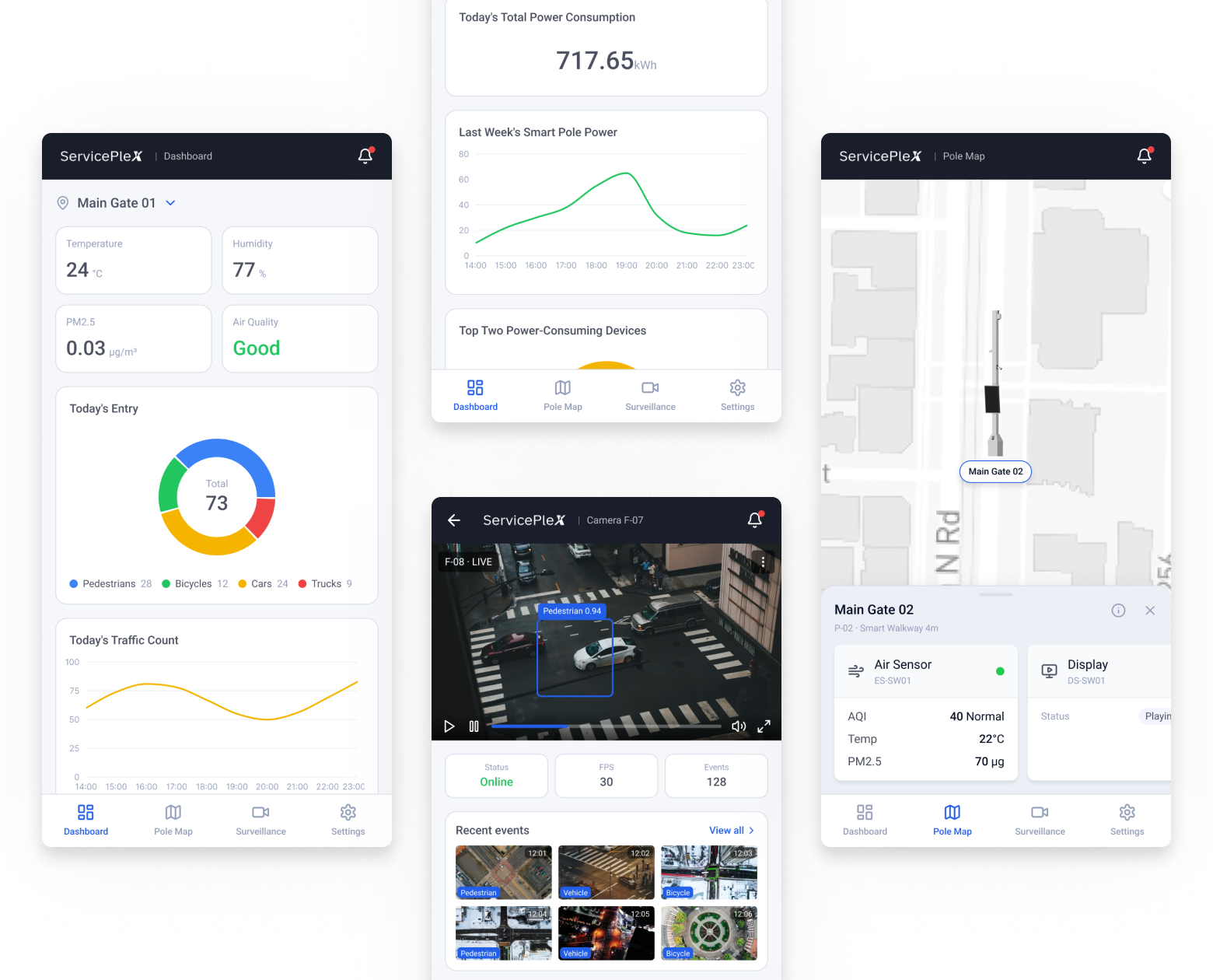
Mobile
The dashboard, the pole map, and a live camera feed, on a phone.
From a POC to a product
It started as a working demo, built screen by screen.
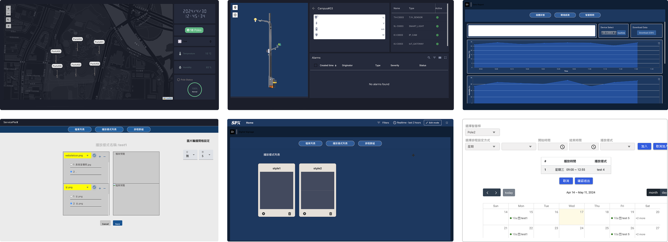
Turning it into a product came down to two things, one design system under every device and an information architecture flat enough to keep taking on more without turning into a maze.
What I unified in the design system
I rebuilt the visual language into one design system, and three things changed the most.
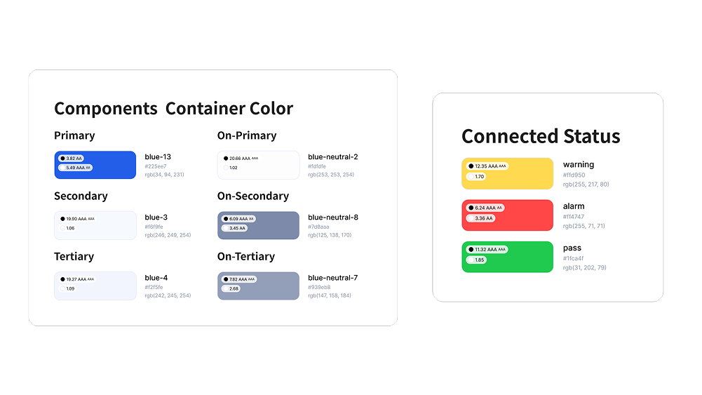
Color
Colors had been picked with nothing tying them together or checking they stayed legible.
→I set one palette and ran it against WCAG contrast standards, so color means the same thing everywhere and text stays readable.
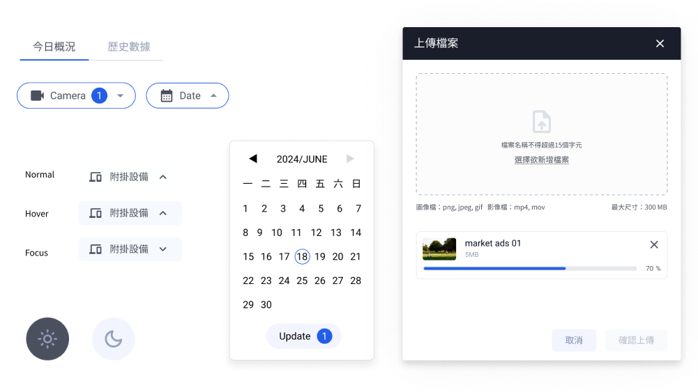
Components
Buttons came in mismatched sizes and corner radii, some too small to hit comfortably, spread across several frontend libraries.
→I pulled them into one component set with consistent sizing and hit areas.
Layout
Structure shifted from screen to screen, tabs on top in one place and at the bottom in another, controls in odd spots or running off the edge.
→I fixed where the core pieces sit and set proper responsive rules, so every device holds the same frame at any size.
As I revisited and reworked the screens, the flow of certain tasks got smoother for the people using them, and the changes carried into engineering too, where the data structures and the APIs behind those flows had to be rewritten.
Together, a new device could reuse what already existed instead of starting from a blank screen.
What I cut for a clear information architecture
Questioning what I'd been asked to build.
Every pole needs a place to show its data. In the POC, each pole got its own page, and the team kept building on that without questioning it. I proposed a second option.
I kept asking myself three questions.
1. Who was this page really for?
The operators in the field. The analytics it was built around were a manager's concern, and managers rarely opened a single pole.
2. How much did an operator actually need?
A glance, whether it was working. The deeper analysis belonged in the dashboard.
3. Would it hold as the platform grew?
Only while it stayed simple. Every pole would keep taking on devices, and a single page would only get more crowded.
With those answers, I made the case to the stakeholders and the team. We agreed to build Option 2, the side panel, with the analytics consolidated in the dashboard.
The result
The side panel was one of several calls like it across the rework. To check whether the architecture work paid off as a whole, I ran a usability test before and after, timing each task. The numbers moved.
The conversations around the product
A design system and a flat architecture got the product ready to grow. The real test was the hardware, and meeting it came down to the people around it.
The VMS made it concrete. Getting it to follow one person or vehicle across a site's cameras meant understanding the cameras themselves, beyond the screen. Our main vendor was Axis, so a frontend engineer and I spent time at their Taipei office learning what their cameras and APIs could and couldn't recognize. Recognition is capped by the camera itself, so I designed around what it could actually deliver.
It kept happening. When an environmental sensor didn't report AQI at all, rather than leave a gap on screen, we derived it in the backend from the standard formula. Each time, the work moved off the screen and into two conversations, one outward to the vendor asking for an API or the data, one inward to engineering about what we could solve ourselves. As the only designer, both were mine to run.
Every new device brought a different vendor and a different limit. Keeping all of it coherent came down to asking the right questions of the people who built and supplied it, inside the team and outside it.