An Alarm Notification Workflow for an AIoT Smart Pole Management System
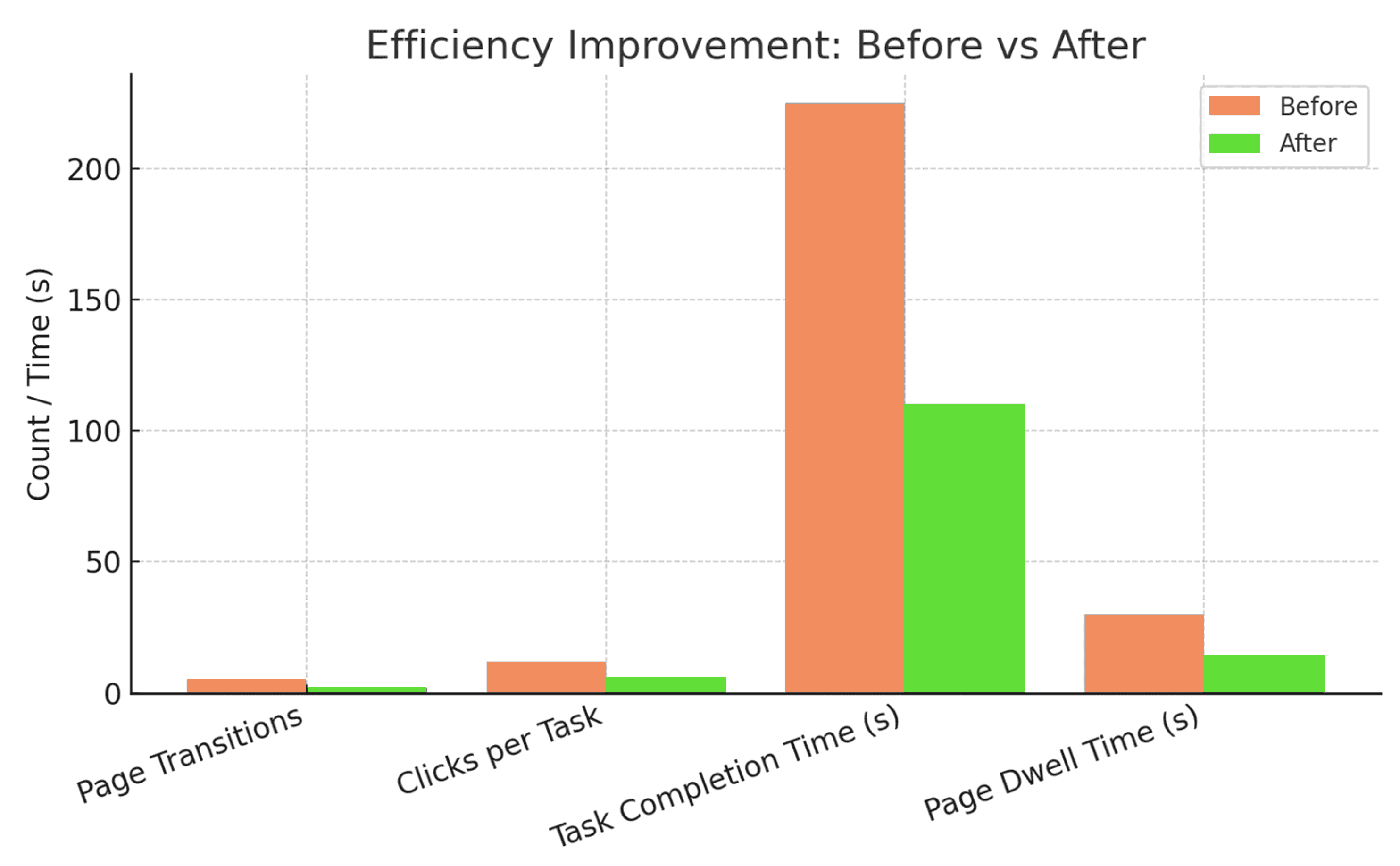
I redesigned the alarm handling workflow. Task time dropped from 3m 45s to 1m 50s: 51% faster, with half the page transitions and half the clicks.
- Industry
- B2B SaaS AIoT
- Role
- UX/UI Designer
- Date
- 2025
- Tools
- Figma, GA4
Time to resolve an alarm (3m 45s → 1m 50s).
Also: page transitions halved (5 → 2), clicks halved (12 → 6), and dwell time per page dropped from 30s to 12s.
Background
The platform is specifically designed to manage various IoT devices to ensure their proper functioning and efficient maintenance.
Challenges
We identified specific efficiency issues in the existing workflow, including excessive clicks, prolonged navigation time, and unclear data presentation.
User goals
The user's daily task involves checking the device status, which includes:
Research findings
We started with user interviews and surveys, discovering that users spent a lot of time on the platform while performing daily tasks. This was primarily due to the following three issues:
Excessive Clicks
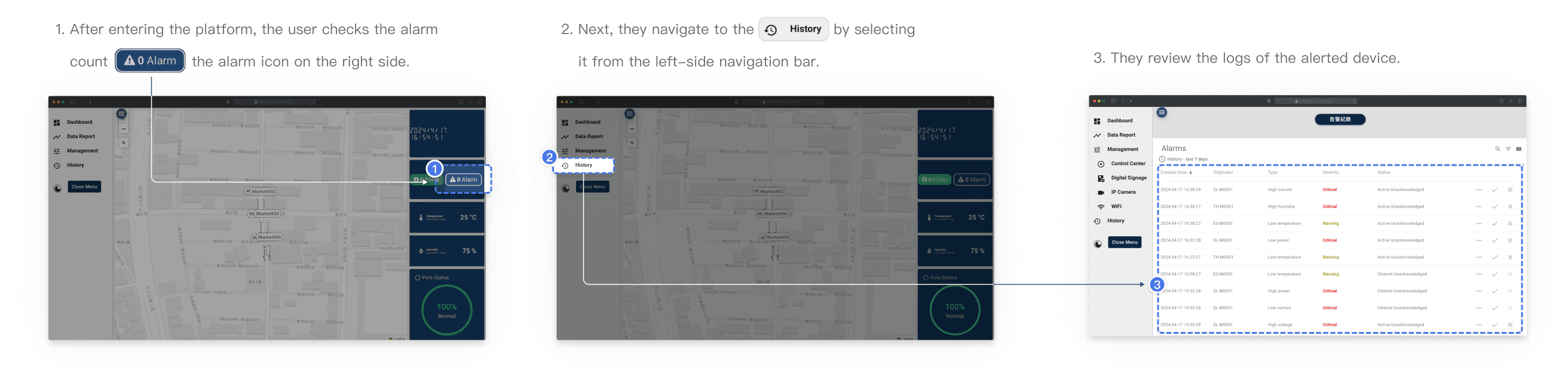
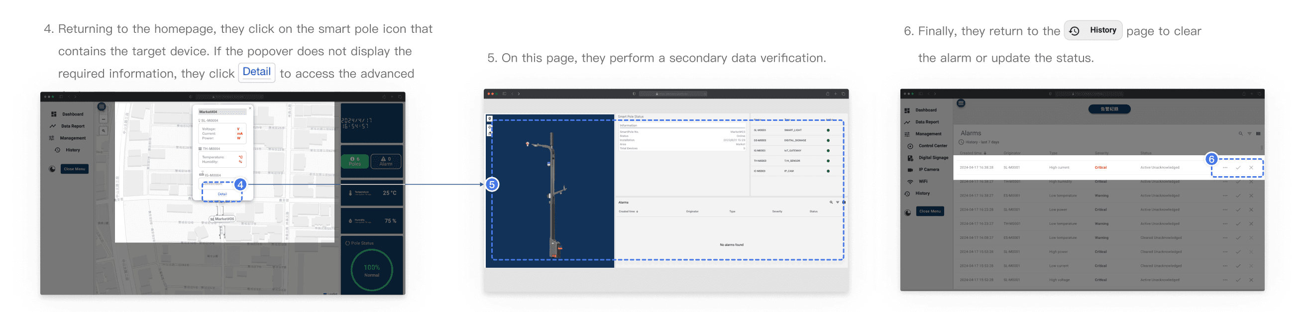
Users had to navigate through multiple pages to confirm device anomalies and assign tasks, leading to inefficiencies. On average, completing a single task required 5 page transitions and 12 clicks.
Time-Consuming Workflows
The process of verifying an anomaly and assigning a task took an average of 3 minutes and 45 seconds, including an average page dwell time of 30 seconds per page before users could locate the necessary information.
Cluttered Information Display
The prolonged dwell time was primarily due to the overloaded interface, where mixed and unorganized information hindered users from quickly identifying the required data.
Design goals
Minimizing Page Hops
By redesigning, we aimed to allow users to complete tasks more quickly.
Enhancing Data Display
Simplifying the display of detailed device information to avoid excessive clicks.
Target 40% Faster Task Completion
Based on initial research, we anticipated achieving at least a 40% improvement in task efficiency by redesigning the workflow, significantly shortening navigation time, and enhancing alarm handling speed.
Design iterations
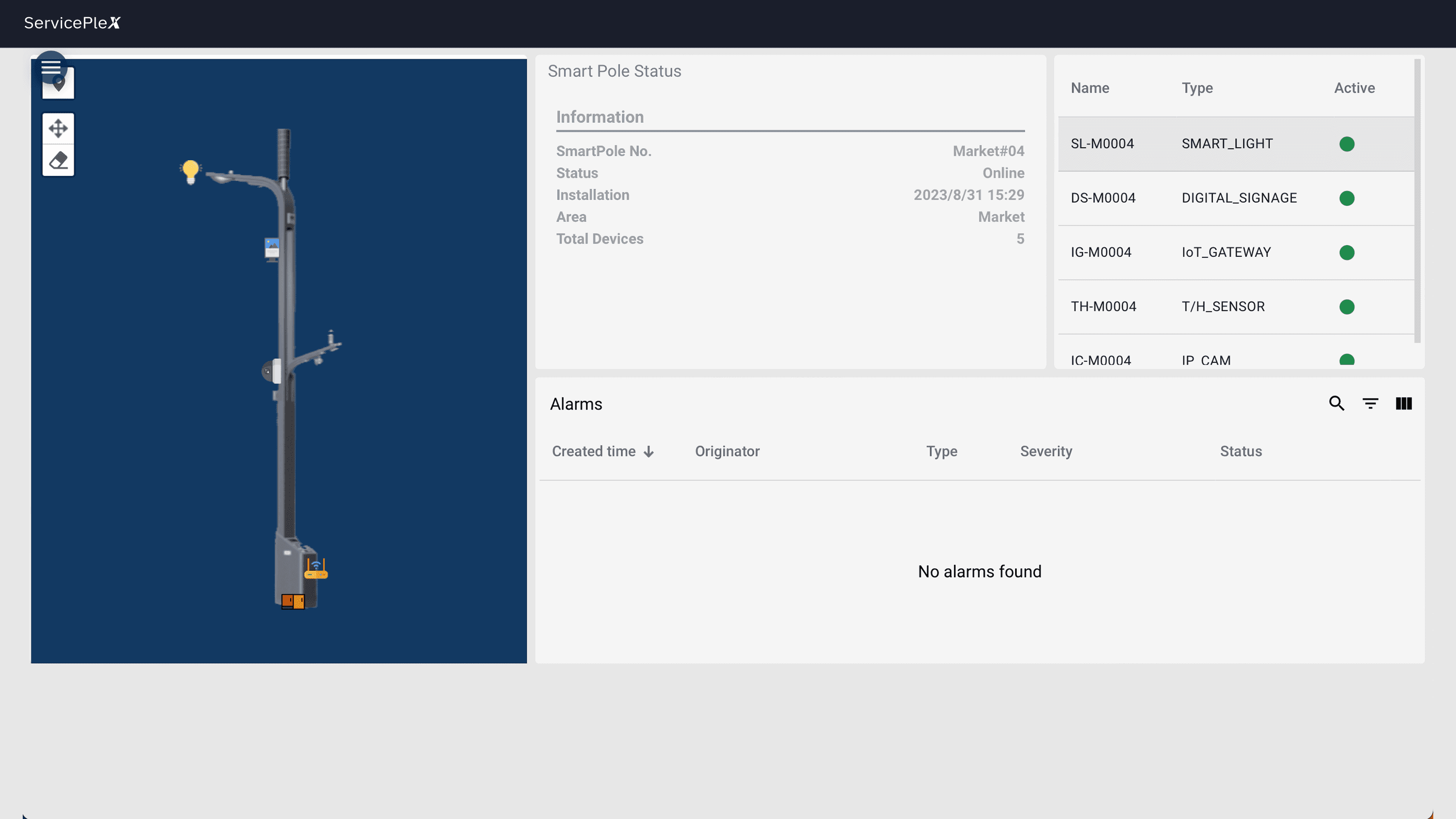
Version 1: Retaining the Device Details Page
- Retain the device details page and redesign the information structure to improve data readability.
- Yes, some devices generate complex data, and this page allows users to view all relevant information at a glance.
- However, this page goes too deep. For less frequently accessed data, users should be directed to the 'Device Management Page.' This page should focus only on the most critical data, enabling users to quickly verify alarm values.
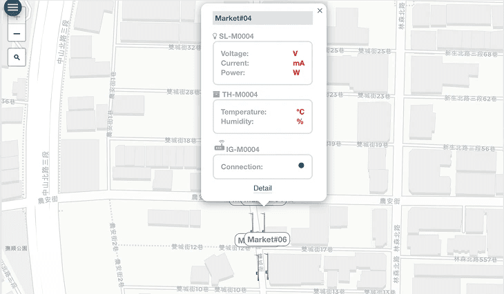
Version 2: Redesigning the Popover and Removing the Device Details Page
- Each device already has its own dedicated management page. Having an additional device details page within the Pole Map may confuse users about where to look for data.
- The popover will display only the essential information needed for handling alarm tasks, speeding up browsing and reducing unnecessary page transitions.
Why Version 2
Version 2 aligns best with user and business goals.
- Scalability: Simplified page hierarchy accommodates growth easily.
- Operational Efficiency: Streamlined workflow reduces clicks and task time.
- Cost Efficiency: Easier maintenance due to reduced complexity.
UX design
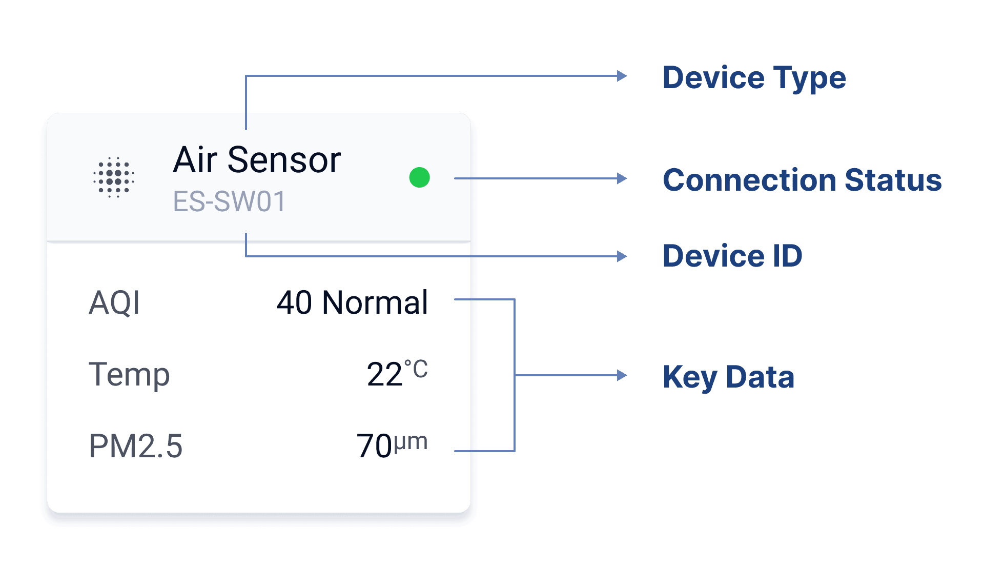
Feature 1 · Modular Visualization of Device Information
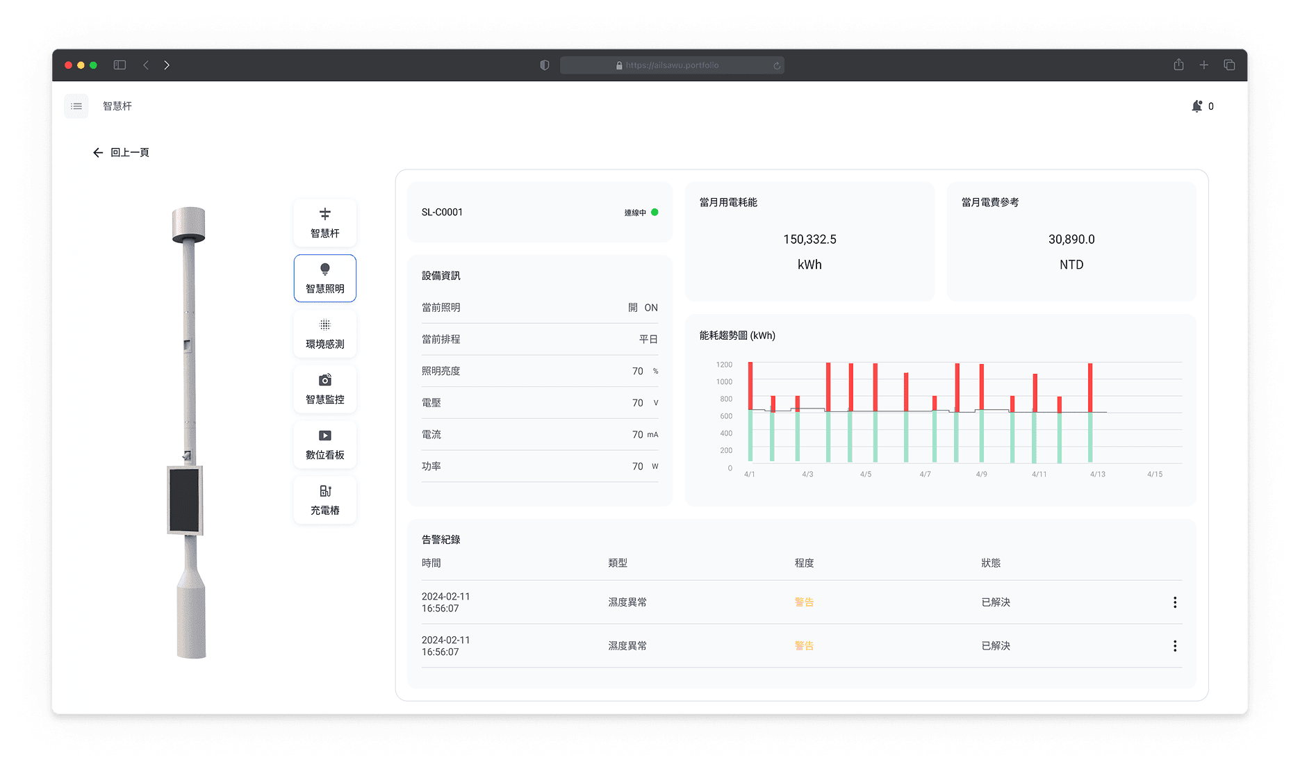
When users click on a smart pole icon in the Pole Map, a right-side slide-in panel will appear, displaying all the devices attached to that pole.
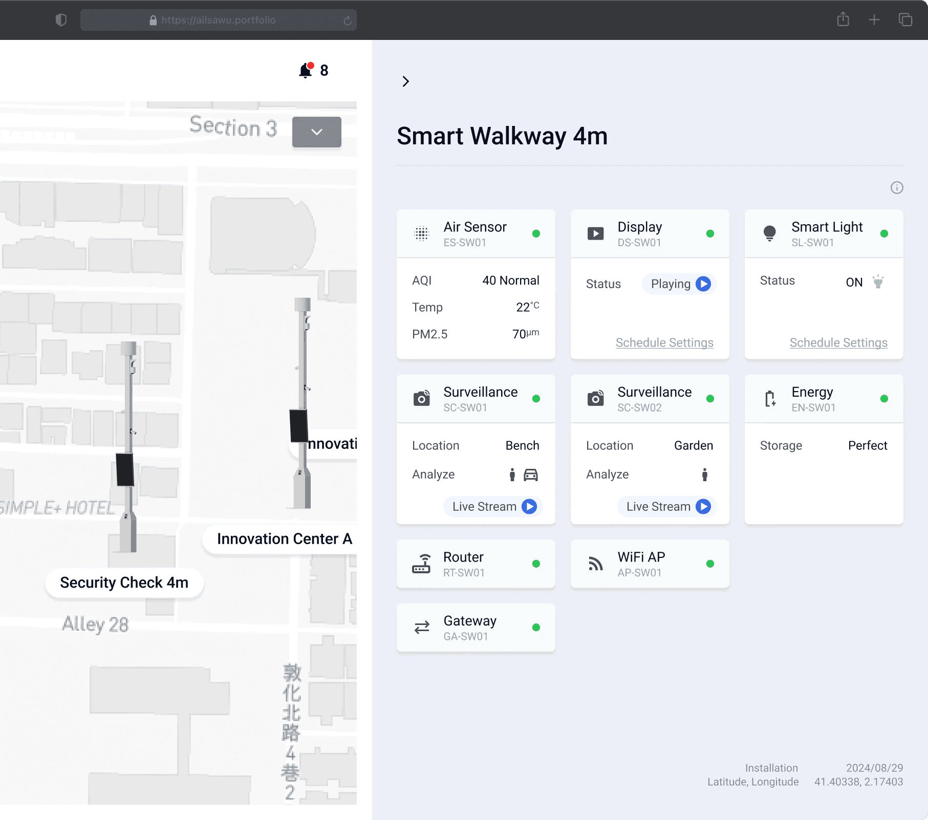
Instead of presenting information in a long table format, we use a modular approach: each device is represented as an individual block. This enhances readability and allows users to quickly grasp key details at a glance.
Feature 1-2 · Quick Device Info Switching
In the previous version, selecting “Detail” would navigate users to a separate page, requiring them to go back and forth between the map and device details to switch between smart poles. In the new version, users can simply click on another smart pole directly on the left-side map to switch views instantly.
“Switching between devices feels so much smoother now. I no longer have to go back and forth between pages just to check different poles.”
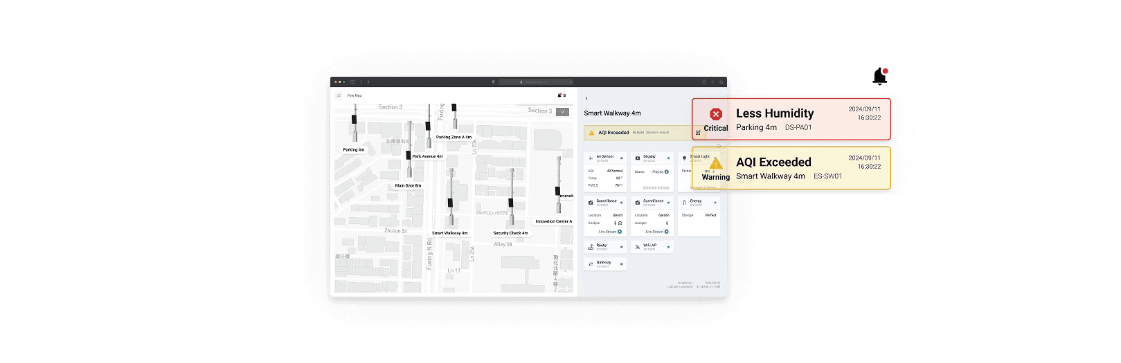
Feature 2 · Instant Alarm Visibility & Fast Response
By reducing unnecessary page transitions and clicks, this feature significantly improves task efficiency and user experience, allowing users to focus on resolving issues rather than navigating the platform.
1. Instant Alarm Notification
Upon entering the Pole Map page, users immediately see real-time notifications for alarmed devices, eliminating the need to manually search for issues.
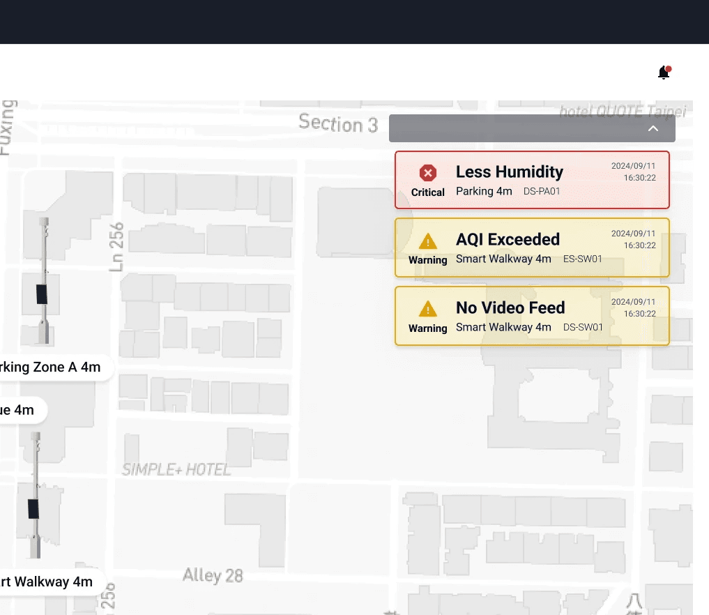
2. Quick Access to Device Information
Clicking a notification opens a right-side panel with details about the smart pole and its devices.
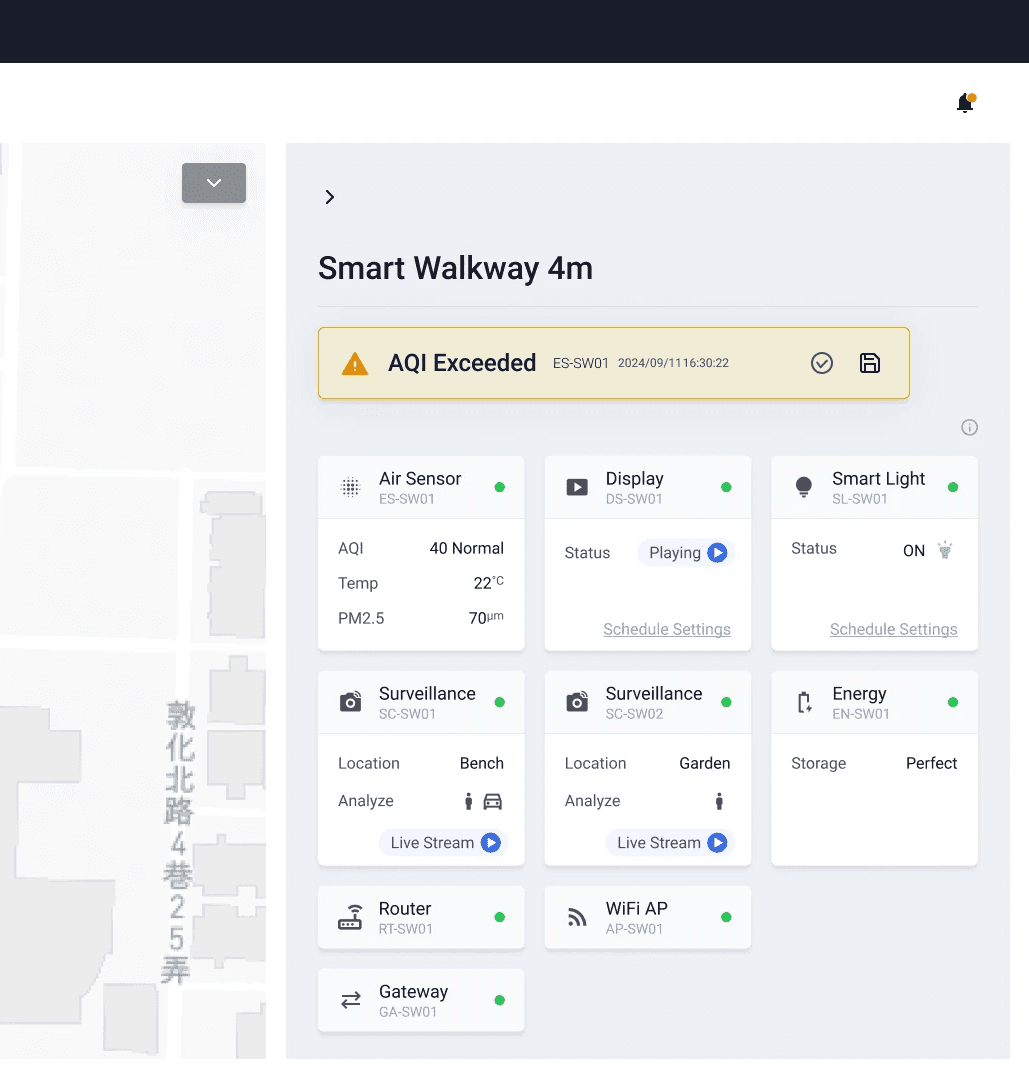
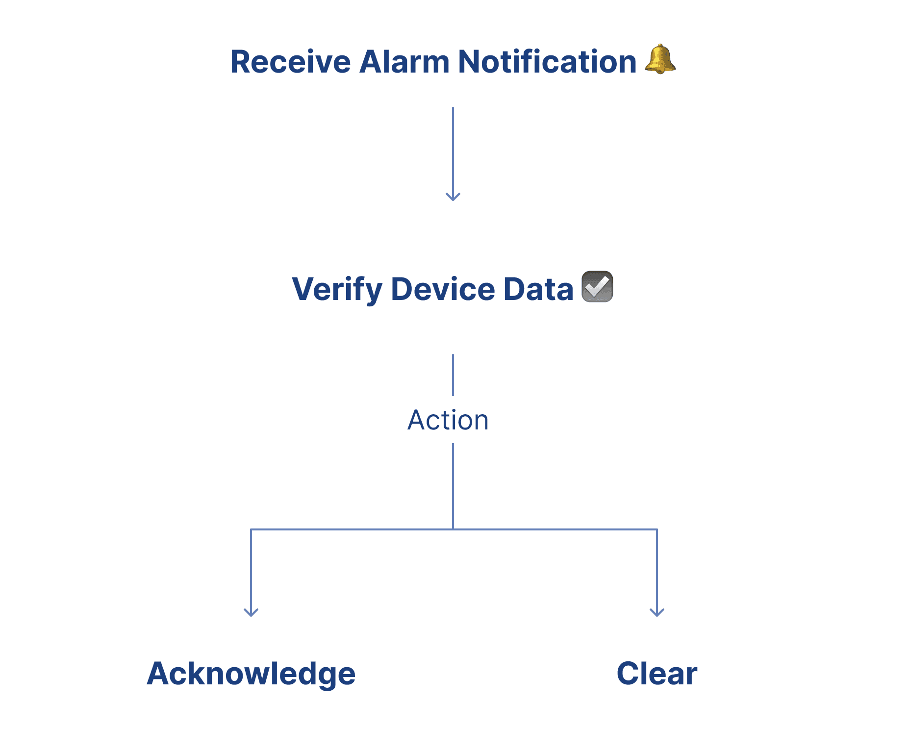
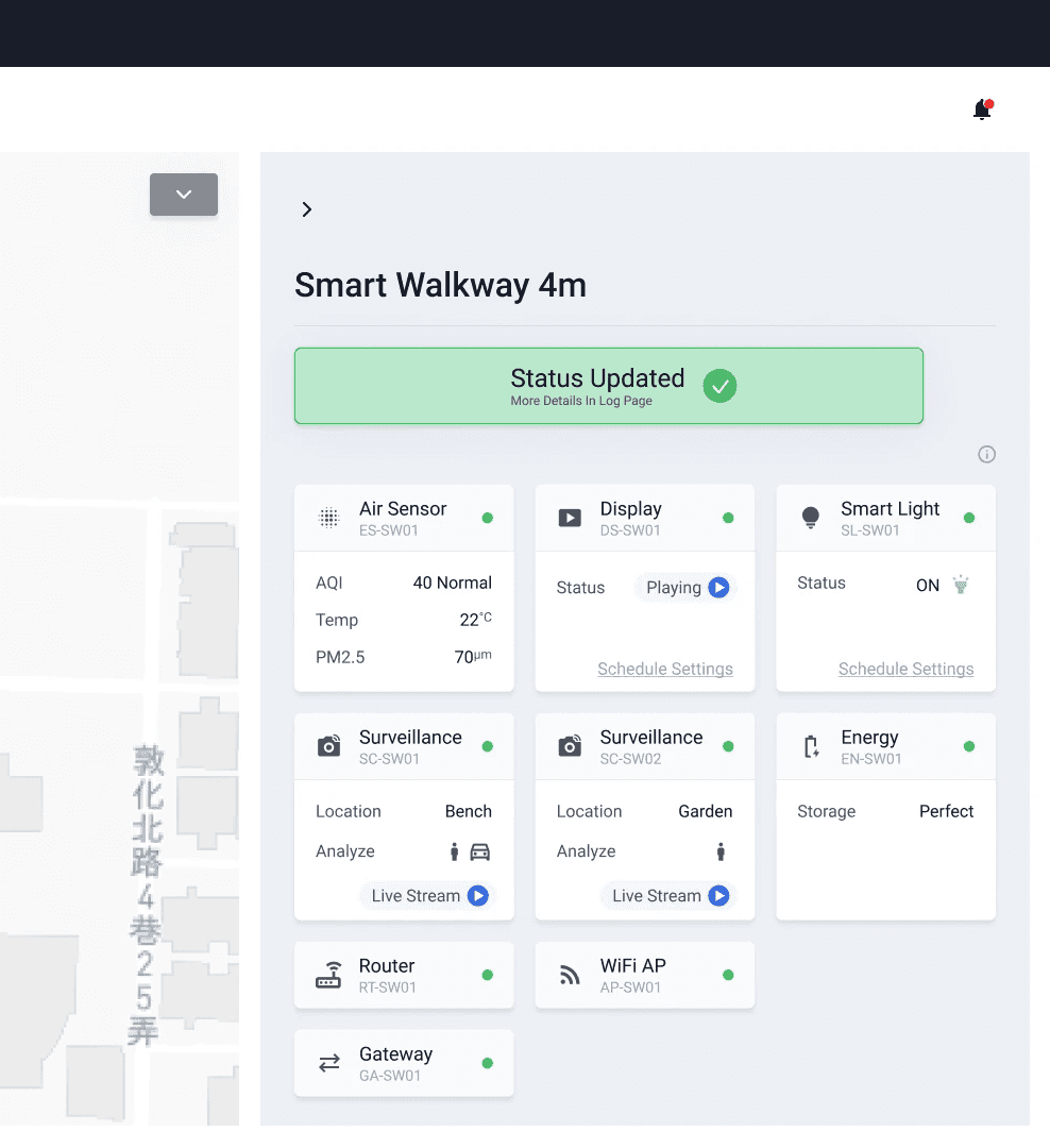
3. Action Execution
Users can directly assign the task for resolution or dismiss the alarm from the same panel, improving response efficiency.
“I can now check and respond to alarms without jumping between pages.”
“It saves so much time and makes the whole process feel more seamless.”
Design conclusion
The task completion time has been reduced by approximately 51.1%, surpassing our initial target of 40%.
Original time (3m 45s) = 225 seconds. New time (1m 50s) = 110 seconds.
Fewer page transitions & clicks
The redesigned workflow streamlined navigation, reducing the average page transitions per task from 5 to 2 and the required clicks from 12 to 6, allowing users to complete actions with fewer steps.
Faster task completion
The new Direct Alarm Notification & Response feature minimized unnecessary navigation and improved access to key information, shortening the task completion time from 3 minutes and 45 seconds to 1 minute and 50 seconds.
Improved information readability
By decluttering the interface and prioritizing critical data, we reduced the average page dwell time from 30 seconds to 12 seconds, enabling users to locate necessary information more quickly and make decisions with greater confidence.
Reflection
Data-driven design clarity
User research and usage data gave me a clear direction. When I could show that a proposed change matched what we observed users doing, alignment with the team came faster.
Navigating complexity through simplicity
The overloaded interface pushed me to focus on what users actually need at each step. Cutting non-essential information made the workflow shorter and decisions easier.
Exceeding expectations through iterative refinement
Setting a 40% target and ending up at 51.1% reminded me that iteration usually matters more than the first solution. Each round of testing surfaced small gaps that, together, moved the number well past where we started.