
Redesigning Global Search for 1,000+ Freight Forwarders
Reworked a search bar that had not changed in ten years into one that reaches every module, keyboard-first, and lands you on the exact record.
A month after launch, not one user had switched back to the old search.
- Role
- Product Designer
- Domain
- B2B SaaS, Logistics
- Timeline
- 2025
- Company
- GoFreight
- Platform
- Web (Responsive)
- Team
- 1 PM, Engineering (FE/BE)
At a glance
To open one record, an operator had to first pick which module it lived in, then dig through a filtered list. Five steps to reach something they could already name.
Sole designer on the redesign. Ran the behavior research, reframed the problem, designed the flow and made the calls on what each result shows, and partnered with engineering through the search-layer rebuild.
A keyboard-first, cross-module search that lands users on the exact record, plus GoFreight's first in-product onboarding pattern, later reused by other features.
A search bar nobody had touched in ten years
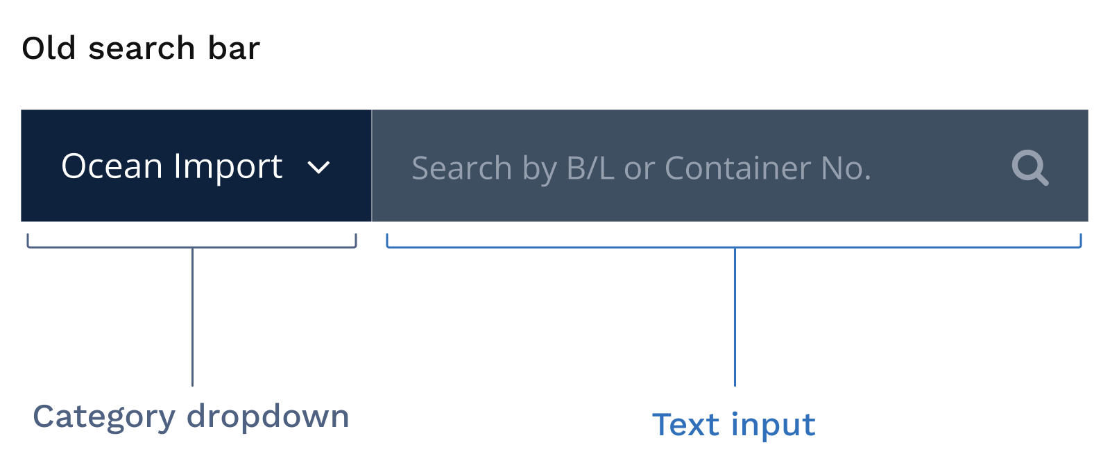
GoFreight is the system freight forwarders run their business on, pulling every import and export shipment into one place. Its main users are operations specialists, or OPs, who spend the day adding and updating shipment records. The tool they reach for most is the search bar. It was a compound control that had not changed in about ten years: a category dropdown on the left, defaulted to Ocean Import, and a text input on the right that read “Search by B/L or Container No.”
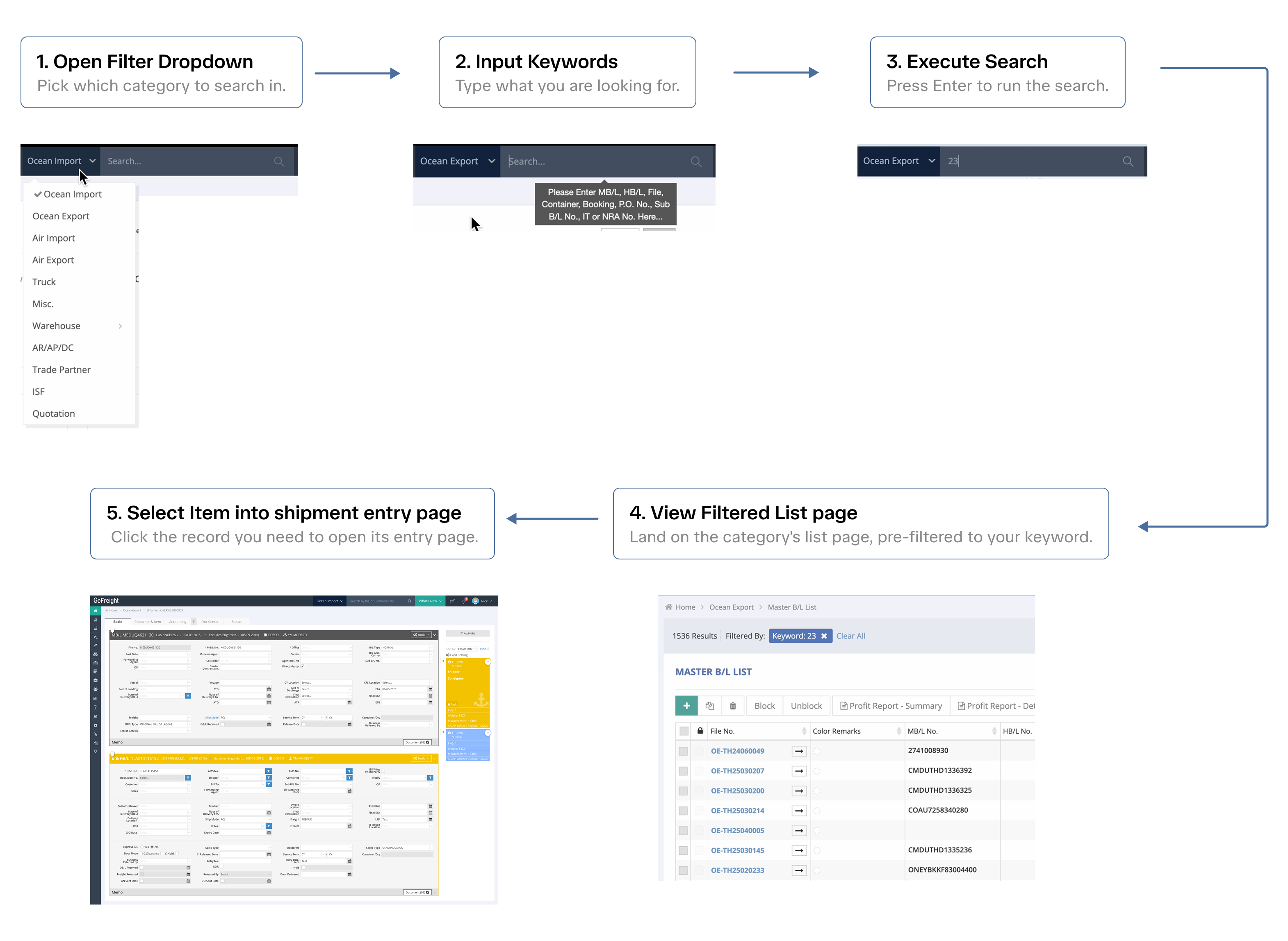
Five steps to open one record
The everyday path went like this: open the category dropdown and pick the right module, type the file number, and hit Enter to run the search. The system dropped you on that module's filtered list page. From there you still had to find your record in the list and click it to open the entry page you were after. Five steps to reach a record you could already name.
Two things bothered me
- 1
It ran against how search should work. You should not have to know which category something lives in before you can look for it. Worse, if you picked the wrong module, the search simply returned nothing, and people assumed the record was not in the system at all.
- 2
It was slow and repetitive. An OP runs this a few hundred times a day, and even at five or ten seconds each, that adds up to real time lost.
My first instinct was simple: take the category dropdown out.
Why the filter existed
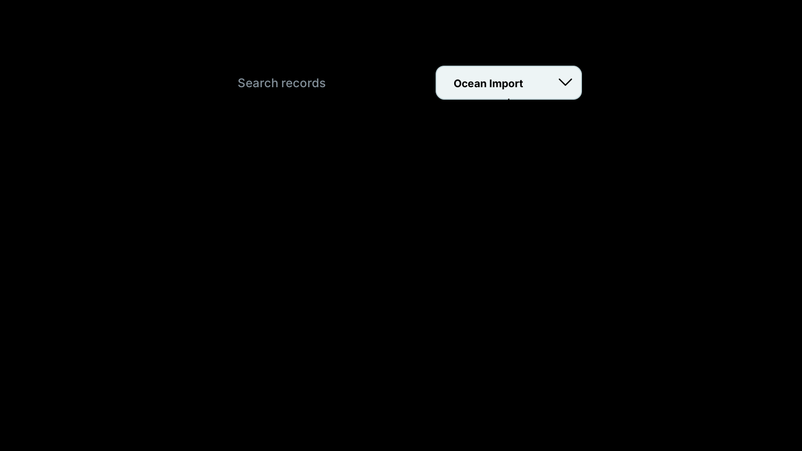
I took that assumption to the engineering team: just remove the dropdown. That is when I understood the original design was a workaround for a technical constraint. Each module stored and indexed its data separately, so the system could only ever look inside one module at a time. The category dropdown was how the old search narrowed things down to a single index. Once we talked it through, the team agreed this was a limit worth breaking, so search could finally run across every module at once.
By the time they search, they already have the record in mind
To see how people actually searched, I combined session recordings in Microsoft Clarity with operator interviews and feedback from our own CS team. Search almost always came down to two behaviors:

An email comes in. The OP copies the number from it and pastes it straight into the search bar.
They know their own file numbers by heart and simply type one in.
What both share: by the time they search, they already have the record in mind. They know the specific record they want and just need to get to it.
That was already a different problem from the one I had assumed I was solving.
Their hands barely leave the keyboard
The same research surfaced something more important. OPs work almost entirely from the keyboard all day, entering data, moving between fields, submitting. But the old search pulled their hands onto the mouse at every step:
- Pick the module from the dropdown.
- Click into the input.
- Select the record on the results page.
Three points, and every single search pulled them off the keyboard three times.
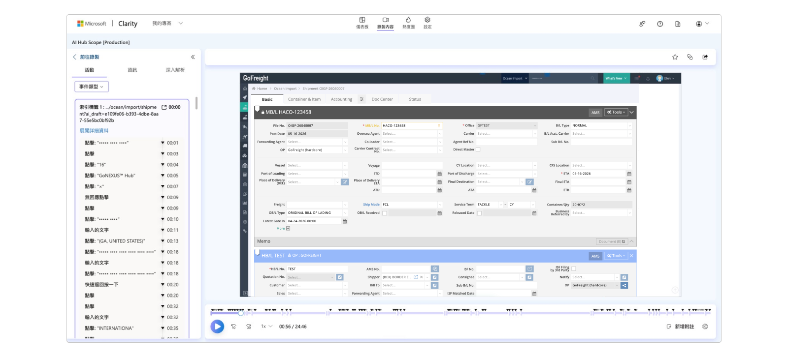
So the problem was no longer just removing the dropdown. It was getting search back onto the keyboard, and cutting the trips OPs made between keyboard and mouse.
Designing the ideal flow, then mapping it to the keyboard
I did not start from the constraints. I started from one question: if nothing got in the way, how would someone expect this to work? The ideal path was short, three beats: type, choose, arrive.
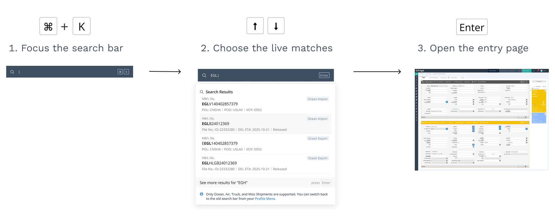
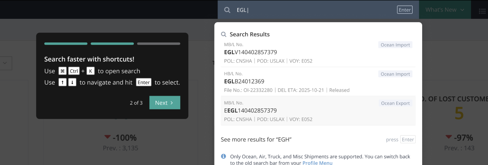
Then I mapped those three beats straight onto the keyboard: Command + K to jump into the search bar, the arrow keys to move through the matches, and Enter to open the one you want. The ideal flow and the keyboard lined up one to one.
The new design
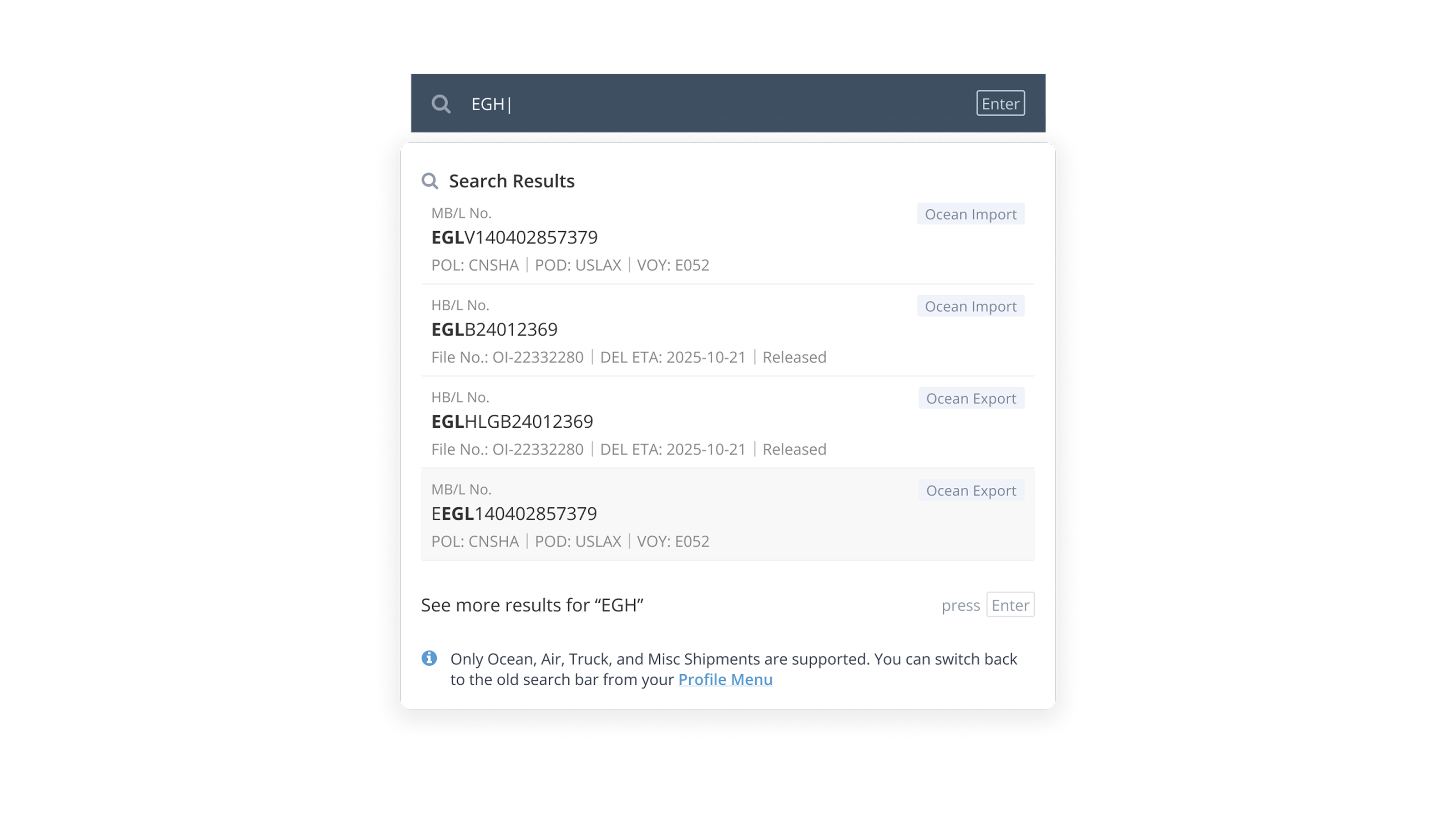
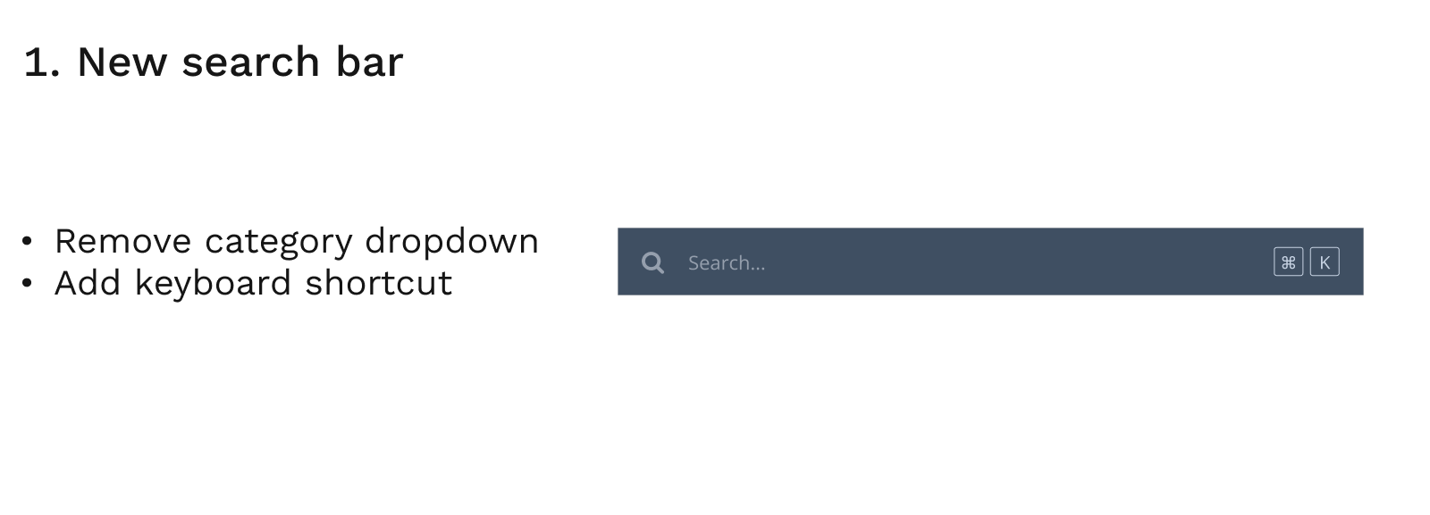
The new search does two things: it drops the category dropdown and adds a keyboard shortcut. The flow is now three steps. Command + K locks focus into the search bar, you type a number and matches appear live, and you pick one to go straight to its entry page. Five steps became three, and the mouse went from required to optional. You can run the whole thing without leaving the keyboard.
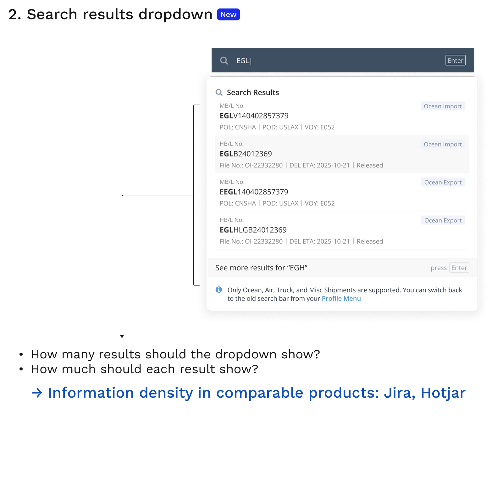
The visible part turned out to be the easy part. The decisions I spent the most time on were underneath. First, how many results to show and how much to put in each one. Too much and the dropdown becomes a wall; too little and people hesitate over whether it is the right record. I looked at the screen sizes our users actually work on, and at how data-heavy products people already trust, like Jira and Hotjar, handle information density. I tuned each result to carry just enough to be recognized. Second, how to order them: with the filter gone, one keyword could hit Ocean Import, Ocean Export and more at once, so I tagged every result with the module it belongs to, keeping the spread readable.
Before locking any of this, I built a prototype and tested it with a few long-term customers, and only moved into development once they confirmed it held up. And none of it would have worked without engineering rebuilding the foundation: a unified search layer that runs across every module at once.
Flexibility and efficiency of use
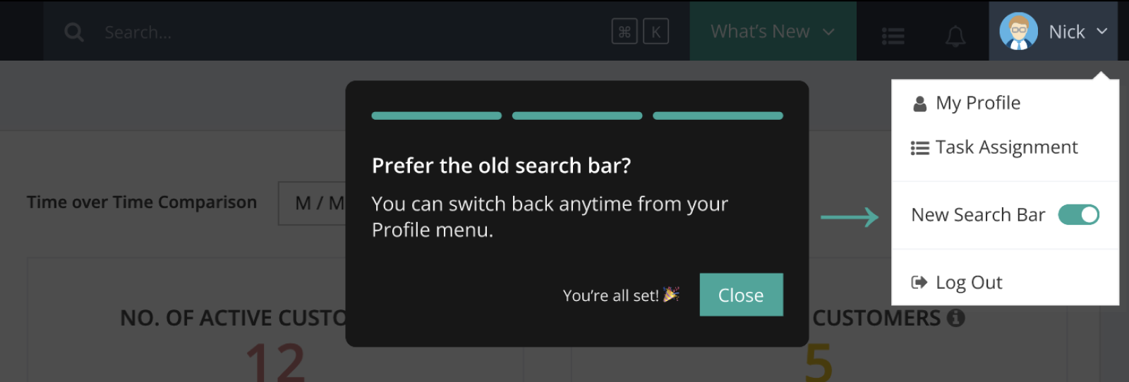
We did not move everyone at once. New customers got the new search by default, while existing customers got a toggle to switch back to the old one whenever they wanted. That followed one of Nielsen's usability heuristics, flexibility and efficiency of use: leave the control with the user. It also left an A/B comparison running in the background: of the people moved onto the new search, how many chose to switch back. That switch-back rate was the most direct signal of whether the redesign actually held up.

GoFreight's first in-product onboarding guide
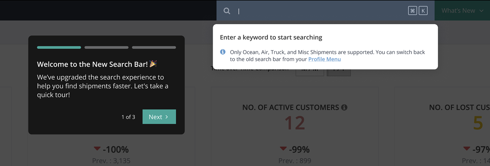
I also designed GoFreight's first in-product onboarding guide to go with it. The hard part was restraint. OPs live in a heavy workflow all day, and a long tutorial would have worked against the whole point of making search simpler. So I kept it to three steps, each icon-led and written as plainly as I could:
The new search, and the shortcut. Global Search is live, and Command (or Ctrl) + K jumps you straight into it.
Smart matches, by keyboard. Type to see the most likely records; move with the arrow keys and press Enter to open one.
Switch back anytime. Prefer the old one? Switch back whenever you want from your profile menu.
The outcome
A month after launch, not one user who had been moved onto the new search had switched back. That was the signal I cared about most: whether people keep using it, rather than what a survey says. The onboarding left something behind too. As GoFreight's first in-product guide, it was reused by later features, including AI ones, and became the team's default way to introduce something new.
What I took from it
What stays with me is that the problem did not look the same at the start as it did at the end. I thought I was removing a step that made no sense, picking a category before you could search. But what actually slowed OPs down was that they worked from the keyboard all day and the old flow kept forcing them onto the mouse. Behavior research moved the problem from the interface to the workflow. The lesson I took: understand how people really work first, then decide how the interface should behave.