
New release
2024
Optimizing IoT alarm navigation for faster issue resolution
Redesigned the alert management workflow, reducing navigation friction, clarifying data presentation, and improving task efficiency by 51%.

Type
Online product
My role
UX/UI Product designer
Team
Software leader, Backend engineer, Frontend engineer
Company
5GIOTLEAD Technology, system integration and software design
Background
SPX is a smart pole management system. Before I joined the team, some user flows had already been defined based on their previous project experience. Despite that, as a UX/UI designer, my main responsibility was to identify potential barriers and ensure the design aligned with with updated business goals.
Interview and test
Empathize users' top priority task in their daily work
Through user interview, we identified that the top priority in their daily workflow is checking device statuses. The standard routine typically follows these steps:

After conducting interviews, we observed how users actually navigated the platform during real tasks. We recorded each action they took to complete a routine status check and compared it to their intended workflow.


However, despite the simplicity of their routine, we discovered that completing it within our platform involved multiple steps and introduced unnecessary friction.
Research Insight
Mismatch between user needs and platform flow
1. Excessive clicks
Users had to navigate through multiple pages to confirm device anomalies and assign tasks, leading to inefficiencies. On average, completing a single task required 5 page transitions and 12 clicks.
2. Time-consuming workflows
The process of verifying an anomaly and assigning a task took an average of 3 minutes and 45 seconds, including an average page dwell time of 30 seconds per page before users could locate the necessary information.
3. Cluttered information display

The prolonged dwell time was primarily due to the overloaded interface, where mixed and unorganized information hindered users from quickly identifying the required data.
Design goal
Target 40% faster task completion
Based on initial research, we anticipated achieving at least a 40% improvement in task efficiency by redesigning the workflow, significantly shortening navigation time, and enhancing alarm handling speed.
📉
Minimizing page hops
By redesigning, we aimed to allow users to complete tasks more quickly.
📈
Enhancing data display
Simplifying the display of detailed device information to avoid excessive clicks.
Design iteration
Target 40% faster task completion
Based on initial research, we anticipated achieving at least a 40% improvement in task efficiency by redesigning the workflow, significantly shortening navigation time, and enhancing alarm handling speed.
📉
Minimizing page hops
By redesigning, we aimed to allow users to complete tasks more quickly.
📈
Enhancing data display
Simplifying the display of detailed device information to avoid excessive clicks.
Design
iterations
Version 1
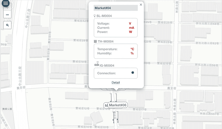
Retaining the Device Details Page
Pros :
✅
Retain the device details page and redesign the information structure to improve data readability.
✅
Yes, some devices generate complex data, and this page allows users to view all relevant information at a glance.
Cons :
🤔
However, this page goes too deep. For less frequently accessed data, users should be directed to the 'Device Management Page.' This page should focus only on the most critical data, enabling users to quickly verify alarm values.

Version 2
Redesigning the Popover and Removing the Device Details Page
Pros :
✅
Each device already has its own dedicated management page. Having an additional device details page within the Pole Map may confuse users about where to look for data.
✅
The popover will display only the essential information needed for handling alarm tasks, speeding up browsing and reducing unnecessary page transitions.
Version 2 aligns best with user and business goals
Scalability - Simplified page hierarchy accommodates growth easily.
Operational Efficiency - Streamlined workflow reduces clicks and task time.
Cost Efficiency - Easier maintenance due to reduced complexity.
UX
design
Feature 1

When users click on a smart pole icon in the Pole Map, a right-side slide-in panel will appear, displaying all the devices attached to that pole.
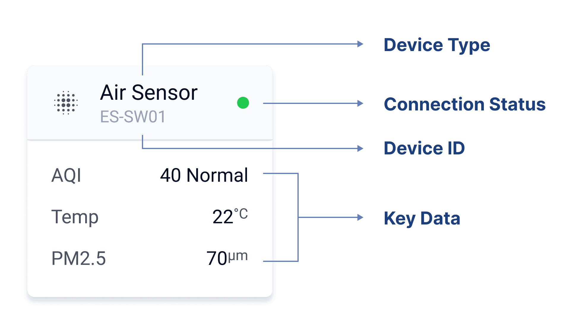
Instead of presenting information in a long table format, we use a modular approach—each device is represented as an individual block. This enhances readability and allows users to quickly grasp key details at a glance.
Iterate version
original version
Feature 1-2
Quick Device Info Switching ✨
In the previous version, selecting “Detail” would navigate users to a separate page, requiring them to go back and forth between the map and device details to switch between smart poles.
In the new version, users can simply click on another smart pole directly on the left-side map to switch views instantly.
Iterate version
Participant A
Switching between devices feels so much smoother now.
I no longer have to go back and forth between pages just to check different poles.
Feature 2
Instant Alarm Visibility & Fast Response ✨
By reducing unnecessary page transitions and clicks, this feature significantly improves task efficiency and user experience, allowing users to focus on resolving issues rather than navigating the platform.
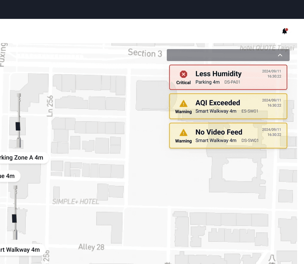
Instant Alarm Notification
Upon entering the Pole Map page, users immediately see real-time notifications for alarmed devices, eliminating the need to manually search for issues.

Quick Access to Device Information
Clicking a notification opens a right-side panel with details about the smart pole and its devices.
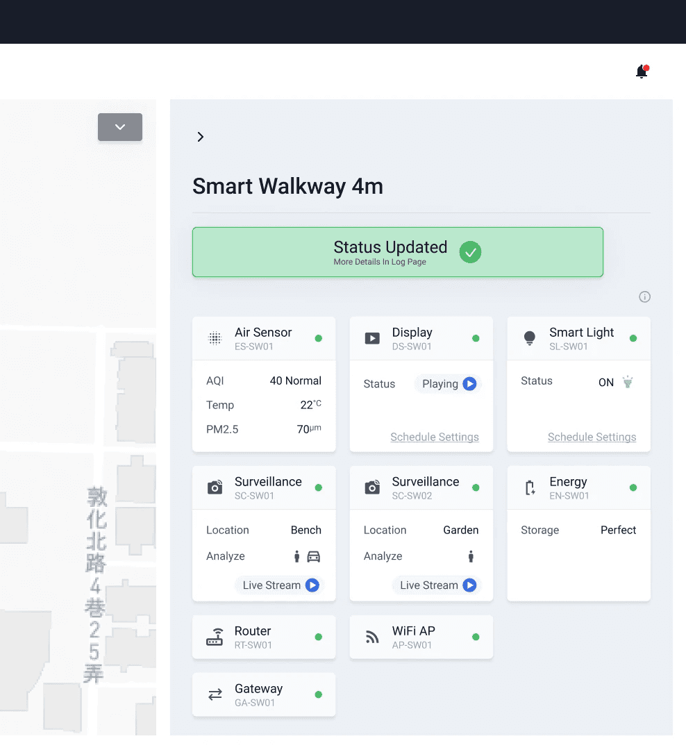
Action Execution
Users can directly assign the task for resolution or dismiss the alarm from the same panel, improving response efficiency.
Participant A
I can now check and respond to alarms without jumping between pages.
Participant B
It saves so much time and makes the whole process feel more seamless.
Design
conclusion
The task completion time has been reduced by approximately 51.1%, surpassing our initial target of 40%.
Original time (3m 45s) = 225 seconds
New time (1m 50s) = 110 seconds
By reducing unnecessary page transitions and clicks, this feature significantly improves task efficiency and user experience, allowing users to focus on resolving issues rather than navigating the platform.
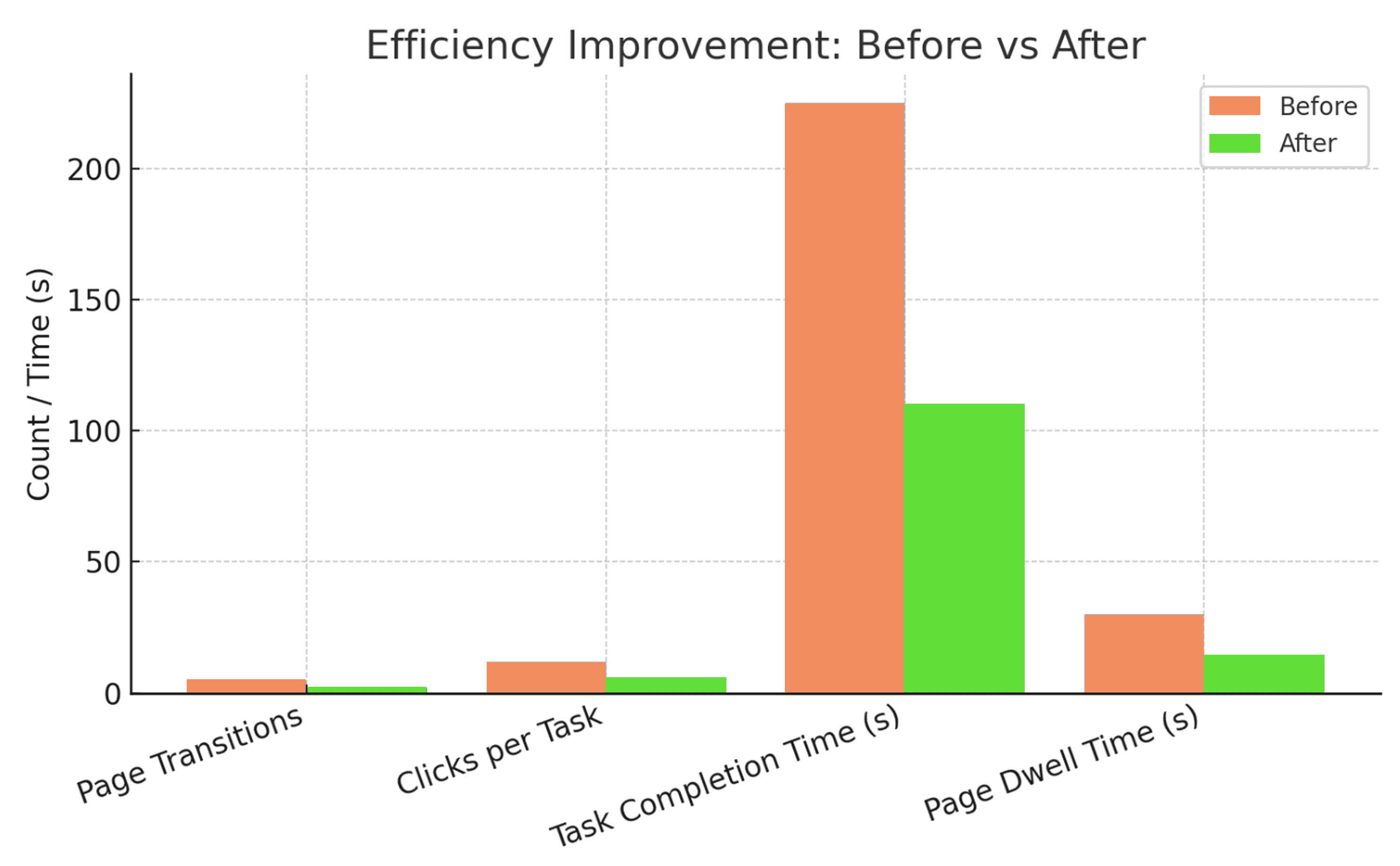
Fewer Page Transitions & Clicks
The redesigned workflow streamlined navigation, reducing the average page transitions per task from 5 to 2 and the required clicks from 12 to 6, allowing users to complete actions with fewer steps.
Faster Task Completion
The new Direct Alarm Notification & Response feature minimized unnecessary navigation and improved access to key information, shortening the task completion time from 3 minutes and 45 seconds to 1 minute and 50 seconds.
Improved Information Readability
By decluttering the interface and prioritizing critical data, we reduced the average page dwell time from 30 seconds to 12 seconds, enabling users to locate necessary information more quickly and make decisions with greater confidence.
Mind
learning
Data-driven design clarity
Throughout this project, I recognized the immense value of leveraging clear data insights in shaping UX decisions. Embracing detailed user research and usability testing not only clarified my design direction but also fortified stakeholder alignment and confidence in the proposed solutions.
Navigating complexity through simplicity
Facing the challenge of an overloaded interface highlighted the essence of simplicity in design. I learned the importance of distilling complex information into intuitive, accessible interactions, significantly reducing cognitive load and enhancing operational efficiency for users.
Exceeding expectations through iterative refinement
Setting a clear, ambitious target (40%) and ultimately surpassing it (51.1%) reinforced my belief in iterative design processes. Continuous testing, feedback, and refinement empowered me to not only meet but exceed initial expectations, driving tangible user and business impacts.
